Design comparison
Solution retrospective
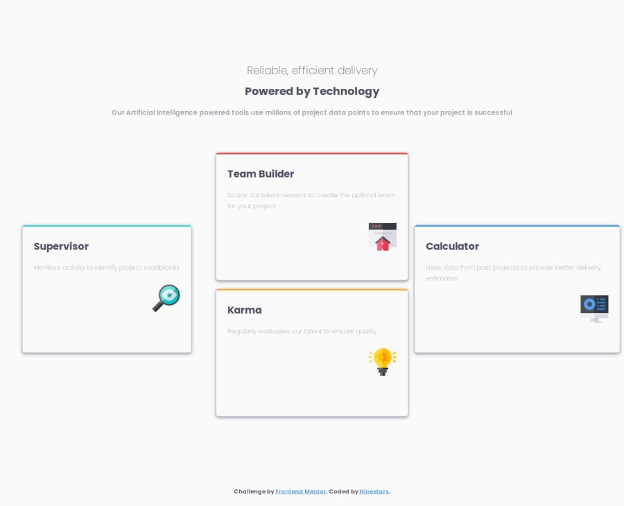
The fact that I used grid for this project makes me proud, I have always avoided the use of grid wherever possible but for this project, I broke my bottleneck.
What challenges did you encounter, and how did you overcome them?I faced challenges in making my left and right card centered on the desktop but with the help of google, I was able to get a simple method of solving the problem.
What specific areas of your project would you like help with?I have been making progress regarding less code when necessary and there has been improvement, but I would love to make more progress regarding it whereby I do not have to write redundant codes.
Community feedback
- @luccyyy97Posted 12 months ago
I think would look better by setting a consistent width across all your card. Keep up the good work!
1
Please log in to post a comment
Log in with GitHubJoin our Discord community
Join thousands of Frontend Mentor community members taking the challenges, sharing resources, helping each other, and chatting about all things front-end!
Join our Discord
