Submitted 5 days ago
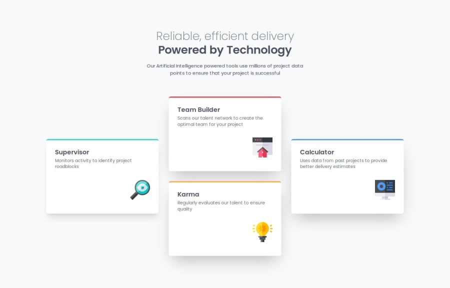
Responsive four card layout using tailwindcss
#tailwind-css

@NunoJDMachado

Design comparison
SolutionDesign

Solution retrospective
What are you most proud of, and what would you do differently next time?
I'm proud of putting multiple flexbox features into practice. Maybe next time I'll practice grid.
What challenges did you encounter, and how did you overcome them?When resizing the browser window to test responsiveness I noticed that the cards weren't being squished identically. Some remained bigger than others. To solve that I used a combination of fixed width and min-width, which helped a lot.
What specific areas of your project would you like help with?But still I notice around the tablet breakpoints that the two cards in the middle are getting more squished than the others, even though they have the same css applied. How can I fix this?

Join our Discord community
Join thousands of Frontend Mentor community members taking the challenges, sharing resources, helping each other, and chatting about all things front-end!
Join our Discord