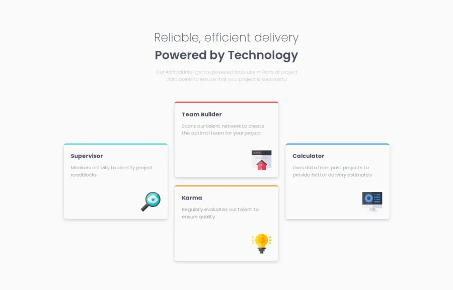
Responsive four card feature session using flexbox and grid


Design comparison

Solution retrospective
I'm proud of the fact I was able to learn CSS grid and then design the page using both flexbox and grid.
I'll use CSS grid more going forward.
What challenges did you encounter, and how did you overcome them?The challenge I encountered was when reducing the screen size, the left card shrinks first, instead of all the cards. I later remembered(after a long while XD) that I needed to set the grids using the fr unit, this allowed the layout to remain proportional and responsive, as fr distributes the available space equally among the grid items.
I would love feedback on my use of Grid and Flexbox, especially when it comes to how I combined the two for layout flexibility and responsiveness.
Thank you in appreciation :))
Community feedback
- @SifanfisehaPosted 2 months ago
cool!!
1

Please log in to post a comment
Log in with GitHub
Join our Discord community
Join thousands of Frontend Mentor community members taking the challenges, sharing resources, helping each other, and chatting about all things front-end!
Join our Discord