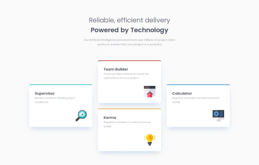
Responsive Four Card Feature Section
Design comparison
Solution retrospective
I managed to easily combine both CSS Grid and Flexbox to achieve the layout I wanted.
What challenges did you encounter, and how did you overcome them?I had trouble with the top border of the cards. I wasn't able to make it look just like the design. I tried using pseudo-elements to create the border and have more control over it's appearance, but I didn't like the way it looked in the end. I finally settled with styling the top border the normal way.
What specific areas of your project would you like help with?-
Are the HTML elements used appropriately and semantically correct?
-
Are there any accessibility improvements that I should make?
-
Is the use of CSS Grid and Flexbox appropriate and efficient or are there any improvements that I can make to the layout?
-
Any feedback on the best practices that I'm not following or overlooked mistakes.
Community feedback
- @TusharKaundalPosted 6 months ago
Nice its responsive; it looks great on mobile, tablet, and desktop.
One suggestion if you're developing CSS, make sure to use variables for fonts, font sizes, font family, weight, color, and so on.
Otherwise its look good
1
Please log in to post a comment
Log in with GitHubJoin our Discord community
Join thousands of Frontend Mentor community members taking the challenges, sharing resources, helping each other, and chatting about all things front-end!
Join our Discord
