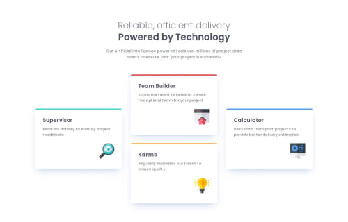
Responsive Four Card Feature Section with Flexbox, CSS Grid, and Sass

Solution retrospective
I'm glad I was able to make the layout responsive across different devices. I also made some adjustments for 1024px screens, as I felt a different layout would be more suitable for that resolution. I could have followed the design more closely, but I decided to stick with this approach.
What challenges did you encounter, and how did you overcome them?The biggest challenge was designing a flexible layout that smoothly transitions from a single-column structure on mobile to a three-column layout on desktop. I experimented with both Flexbox and Grid but found Grid to be the more intuitive and efficient solution, so I decided to stick with it.
What specific areas of your project would you like help with?I spent a lot of time considering the best way to achieve this responsive design without using breakpoints. If anyone has ideas, I'd love to hear them! Any feedback on my solution would also be appreciated.
Please log in to post a comment
Log in with GitHubCommunity feedback
No feedback yet. Be the first to give feedback on Akiz-Ivanov's solution.
Join our Discord community
Join thousands of Frontend Mentor community members taking the challenges, sharing resources, helping each other, and chatting about all things front-end!
Join our Discord