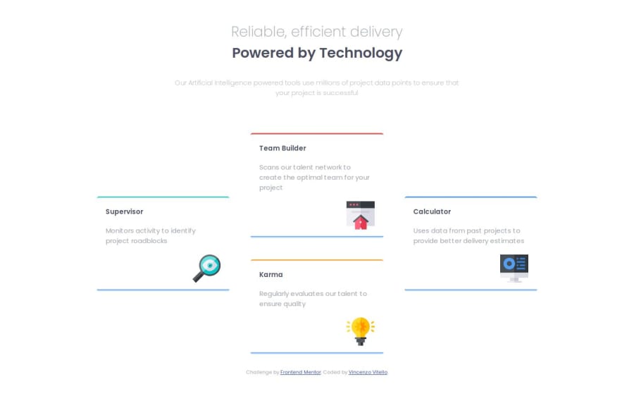
Responsive four card feature section with CSS Grid


Design comparison

Solution retrospective
I started coding desktop first and than I had big troubles in making changes for mobile design, so I had to start the grid system from scratch thinking mobile first, and I went smoother. So I guess I'll always go mobile first from now on.
What specific areas of your project would you like help with?When I used to work as a frontend dev I only used Flexbox ignoring the existance of grid, so now I find it a bit hard to understand it because it can do so many things in so many ways that guys pls help me. Anyway, I guess I just need some more practice, but if you happen to read my code and any suggestion comes to your mind, I appreciate you hitting up. Thanks anyone, keep coding hard!
Community feedback
- @BasselfathyPosted 4 months ago
Nice work, Vincenzo👏 You have done a great job so far!
I have reviewed your code and there are two improvements you can do.
-
While you already using
display:gridfor the<main>on large screens, you don't need to change it toflexwithcolumn directionfor small screen. -
For the cards shadow, instead of using
::afterto create it you can usebox-shadowproperty...something like that. -
box-shadow: 0px 15px 30px -5px #color;
Marked as helpful0 -


Please log in to post a comment
Log in with GitHub
Join our Discord community
Join thousands of Frontend Mentor community members taking the challenges, sharing resources, helping each other, and chatting about all things front-end!
Join our Discord