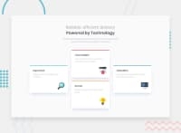
Responsive Four Card Feature Section with CSS Flexbox
Design comparison
Solution retrospective
I am proud of my improvement.
What challenges did you encounter, and how did you overcome them?In this project, in desktop view, the middle column has two cards one below another while the other two columns have one card. I encountered a challenge immediately when started solving the desktop view. But it took no time to make me decide that I should divide the cards into three columns and then apply the flexbox method.
What specific areas of your project would you like help with?In the design, the top border style is a little different at the edge from my solution. Maybe anybody can help me with that. Besides, I want to see other solutions.
Community feedback
- @snakechickensoupPosted 5 months ago
I experienced the same issue. Initially, I styled the card using border-top, but it didn't match the example design. So, instead of using border, I placed a div element at the top, set its height, filled its background color, and then applied overflow: hidden to the card element. This approach made the design look more like the example. I'm not sure if this is the correct method, but I hope it helps!
Marked as helpful1@ttanvirrPosted 5 months ago@snakechickensoup Thank you, mate. You've given me a solution.
0
Please log in to post a comment
Log in with GitHubJoin our Discord community
Join thousands of Frontend Mentor community members taking the challenges, sharing resources, helping each other, and chatting about all things front-end!
Join our Discord

