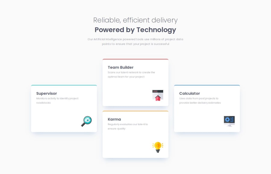
Design comparison
Solution retrospective
I’m proud that I tried a mobile-first workflow, as I usually follow a desktop-first approach for responsive projects. Next time, I’d like to use CSS Grid to structure my layout instead of Flexbox.
What challenges did you encounter, and how did you overcome them?I was initially confused about how to manage the layout change from mobile to desktop. I figured it out by creating responsive layouts using the flex-direction property. For the mobile layout, I set three column-shaped `` elements in a flex container with flex-direction: column and stacked them vertically. Then, I added a media query for desktop, changing flex-direction to row so the columns aligned horizontally.
Community feedback
Please log in to post a comment
Log in with GitHubJoin our Discord community
Join thousands of Frontend Mentor community members taking the challenges, sharing resources, helping each other, and chatting about all things front-end!
Join our Discord
