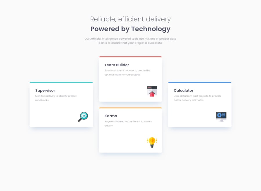
Responsive Four Card Feature Section with BEM, CSS Grid, and Flexbox
Design comparison
Solution retrospective
Hey everyone!
It took me a while to wrap my head around laying this one out. I would really appreciate any feedback on my semantic HTML, my use of Grid and Flexbox here, and the overall responsiveness of the page. If anyone has any suggestions on ways that I can improve the layout in order to make it more effective, please let me know!
I also used BEM for the second time on a project here, and any feedback or comments on how I could improve would be really appreciated.
Thank you so much!
Community feedback
- @grace-snowPosted over 3 years ago
Hey, this looks really good, well done!
Only small suggestions quickly
@media screen and (min-width: 535px) {
  .wrapper {
    /* grid-template-areas: "cyan red" "cyan red" "orange blue" "orange blue"; */
    grid-template-areas: "cyan red" "orange blue";
  }
}
I changed this above, because you don't need 4 rows at this screen size. The items were actually in the incorrect grid areas.
Figure is incorrect semantics for these cards. Only use figure when you need figcaption. They should just be Divs IMO, there's not enough content there to justify articles
The
main__figure-imgimages are decorative / meaningless so should not have alt text. Instead, change toalt=""andaria-hidden="true"orrole="presentation"Good luck
Marked as helpful1@grace-snowPosted over 3 years agoOne more suggestion - rather than adding min-height to the grid items like
.main__figureat different breakpoints, why not just define that on the grid template? I doubt it would need to change at different breakpoints.Just an idea
1@brendanmaddenPosted over 3 years ago@grace-snow Grace, thank you. That means a lot, I really appreciate it! Truthfully the majority of my improvement over the last couple of weeks and projects is in very large part thanks to the feedback that you last gave me, so thank you again!
In hindsight it seems silly that I added those extra rows on that grid template 😅 Makes sense - thank you for pointing that out.
I'll make a note about alt text and other attributes on decorative/meaningless images moving forward, and also make sure to only use figure's when I need figcaptions. Hearing the way you think through things definitely helps.
I'm going to have to play around a little bit with your last suggestion there because I can't exactly picture it yet, but I'll dig into it! Setting height and width values has been one of the more challenging things for me wrap my head around so this will be great practice.
Thanks again Grace!
0 - @vanzasetiaPosted over 3 years ago
👋Hi Brendan!
This looks great 🙌 on both landscape and portrait on my mobile device. 👍Good job! 👏
I have some feedback on this solution:
- For each title for every figure, It should not be a heading two. Heading tags only for titling a section. I recommend to use
pandstrongtag. - In this case, all images are decorations. So, it's best to leave the
alt=""empty. That way, the screen reader will ignore those images.
That's it! Hopefully this is helpful!
Marked as helpful1@brendanmaddenPosted over 3 years ago@vanzasetia SO helpful!
Hi Vanza! 👋 Thank you so much for the kind words, and for the amazing feedback. I really appreciate you taking the time!
Semantic HTML and accessibility best practices have been something I've struggled with the most, and I'd really like to keep improving, so I really appreciate every nudge in the right direction.
Love your suggestion instead of the heading two's. I won't forget this moving forward!
Thanks again! 🙏
0 - For each title for every figure, It should not be a heading two. Heading tags only for titling a section. I recommend to use
Please log in to post a comment
Log in with GitHubJoin our Discord community
Join thousands of Frontend Mentor community members taking the challenges, sharing resources, helping each other, and chatting about all things front-end!
Join our Discord
