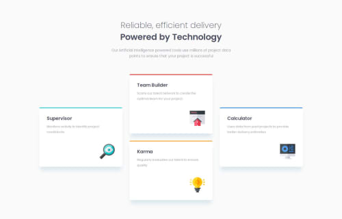
Responsive four card feature section using sass, grid and flex-box lay

Solution retrospective
I'm proud of effectively using Sass mixins and variables to streamline my CSS, making it more modular and reusable. I also successfully integrated CSS Grid and Flexbox within media queries to create responsive layouts that adapt seamlessly to different screen sizes. Additionally, I'm proud that my implementation closely matches the original design.
What challenges did you encounter, and how did you overcome them?One of the main challenges was maintaining responsiveness while preserving the design's integrity across different screen sizes. I addressed this by combining CSS Grid and Flexbox within media queries. I also used Sass mixins to ensure consistent top-line styles across elements. Achieving the perfect box-shadow and spacing required some trial and error, but iterating on my SCSS setup helped me get it right.
What specific areas of your project would you like help with?I'm seeking feedback on optimizing my responsive design, particularly in combining CSS Grid and Flexbox effectively. Additionally, I'd appreciate advice on maintaining clean and efficient Sass code, especially with mixins and variables. Insights on refining box-shadow properties for a more polished look would also be helpful.
Please log in to post a comment
Log in with GitHubCommunity feedback
No feedback yet. Be the first to give feedback on MAGENE Sem Joel's solution.
Join our Discord community
Join thousands of Frontend Mentor community members taking the challenges, sharing resources, helping each other, and chatting about all things front-end!
Join our Discord