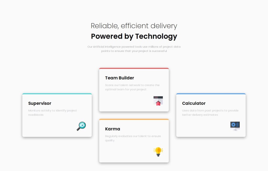
Responsive Four card feature section Using HTML & CSS
Design comparison
Solution retrospective
I am able to make It By myself.
What challenges did you encounter, and how did you overcome them?Header p tag next line text in making in center I overcome from this by give margin-inline to the p tag then it's solved
What specific areas of your project would you like help with?UI/UX Design
Community feedback
- @AdrianoEscarabotePosted about 1 month ago
Hi satish064, how are you doing? I really loved the outcome of your project, but I have a few suggestions that I think might be helpful:
Consider using
remfor font size .If your web content font sizes are set in absolute units, such as pixels, the user will not be able to re-size the text or control the font size based on their needs. Relative units “stretch” according to the screen size and/or user’s preferred font size, and work on a large range of devices.if you want to continue coding with
px, you can download a very useful extension in vscode, it convertspxtorem!link -> px to rem
The rest is excellent.
I hope you find it useful. 👍
Marked as helpful0
Please log in to post a comment
Log in with GitHubJoin our Discord community
Join thousands of Frontend Mentor community members taking the challenges, sharing resources, helping each other, and chatting about all things front-end!
Join our Discord
