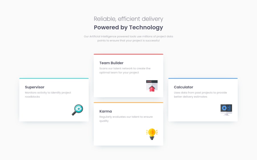
Responsive four card feature section using Grid and Flexbox
Design comparison
Solution retrospective
Is it okay that the page is too wide and scrollable? If not, how can I fix it?
Your feedback is greatly appreciated.
Community feedback
- @kxnzxPosted over 2 years ago
@OhSorrow your solution looks neat! Well done!
It does not scroll and the page is not too wide.The page is only scrollable when the toolbar is enabled and that's fine.
You can use a max-width on the container if you want to prevent that the width of the container grows, when you enlarge the screensize. Another advantage of using a max-width is that when you shrink the screensize the container will scale down. However in your case it's unnecessary, because you used (grid-template-columns: 1fr;) on the container, which keeps the container in one fraction of the available place. Well done!
Marked as helpful1
Please log in to post a comment
Log in with GitHubJoin our Discord community
Join thousands of Frontend Mentor community members taking the challenges, sharing resources, helping each other, and chatting about all things front-end!
Join our Discord
