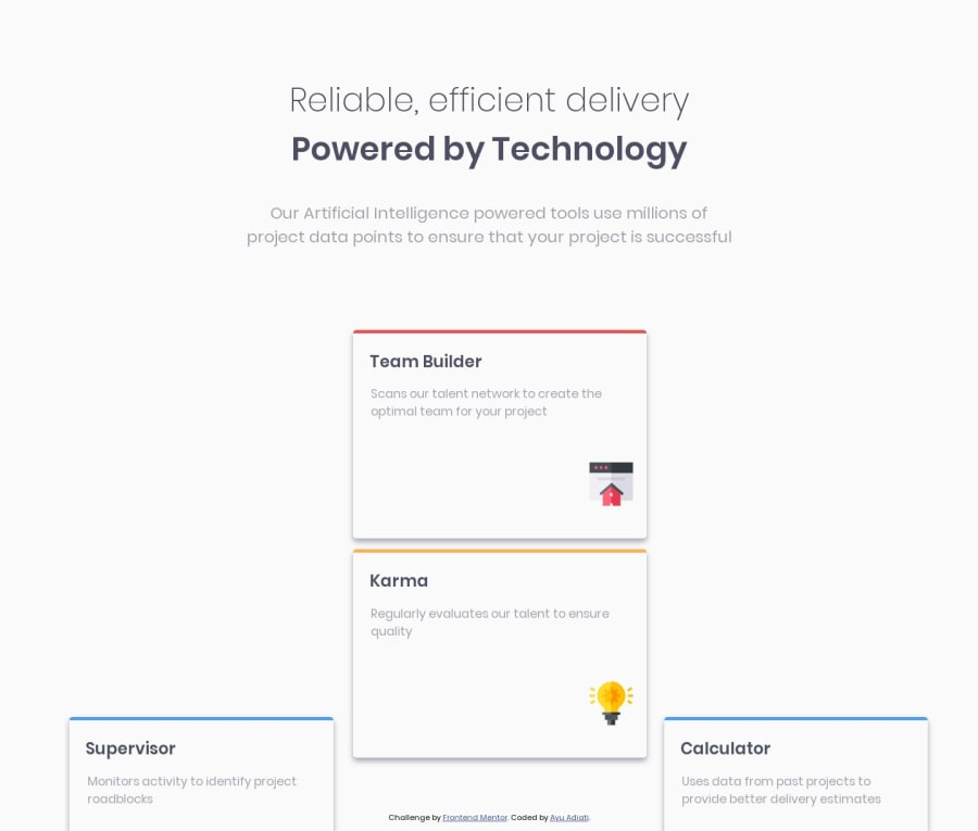
Design comparison
Solution retrospective
I had trouble in maintaining card's width & height in laptop size. Especially whe it combines with position (absolute / relative).
Any suggestion on how to do this?
Community feedback
- @whimsicurl-creationsPosted over 4 years ago
Hello, Ayu. I recently completed this challenge as well. I approached it using CSS Grid. I'm not sure if you've used it before or not, but one of the options with CSS Grid is to define grid template areas so you can arrange your layout just the way you want without changing any HTML.
With Flexbox, you might consider creating three columns of content that are inside of a container. That way you can have the left column and right column with only one card that is vertically centered. The middle column would contain two cards. Whether you're working with Flexbox or CSS Grid, I highly recommend the guides on CSS Tricks - they are very informative and the visuals really help clarify the concepts. You can find the link (amongst other INCREDIBLE links) in the Resources link at the top of the Frontend Mentor site.
1@adiati98Posted over 4 years agoHi @whimsicurl-creations, Thank you so much for the feedback!
I always confuse myself with grid. And I haven't try grid template area at all. I think I will look it up and learn how it works :D
I didn't think of grouping the cards into 3 columns! It make sense now! Thank you for pointing it out :)
1@whimsicurl-creationsPosted over 4 years agoHappy to help, @adiati98! In addition to CSS Tricks, I also used Grid Garden and Wes Bos' CSS Grid course (both are listed on the Frontend Mentor Resources page). They are great for learning and trying out the techniques yourself. I highly recommend them to get familiar with CSS grid and its capabilities.
0
Please log in to post a comment
Log in with GitHubJoin our Discord community
Join thousands of Frontend Mentor community members taking the challenges, sharing resources, helping each other, and chatting about all things front-end!
Join our Discord
