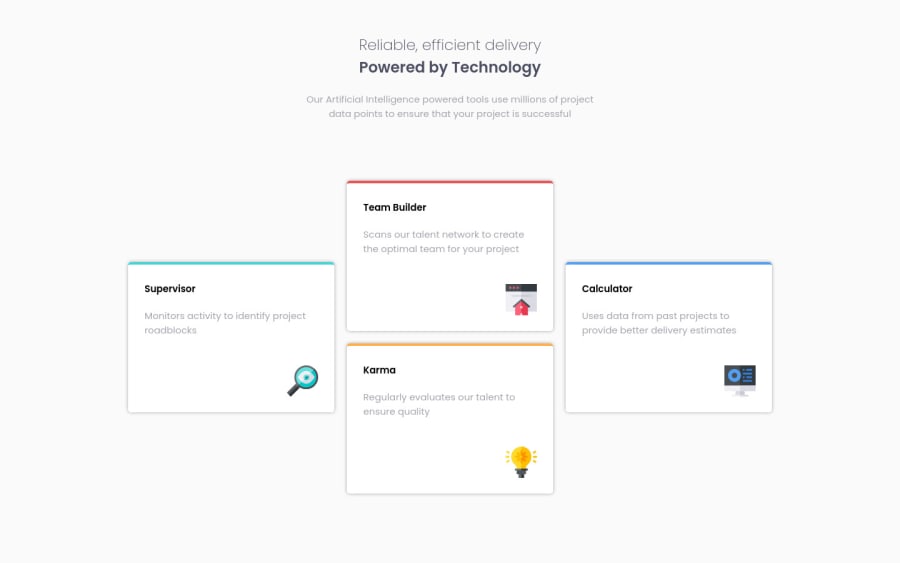
Responsive Four Card Feature Section using CSS Grid and Flexbox
Design comparison
Solution retrospective
Hi there! I stumbled upon two different problems with this project.
The first is that I do not understand when to use min-width and max-width with the media queries. What is the best practice regarding the use of these properties for media queries? What should I search for learning about this?
The second problems is related to the relative units. I have read that for responsive website we should use relative units. Should I use relative units on all properties? What relative units should I be using in this specific project?
Thanks :)
Community feedback
- @darryncodesPosted almost 3 years ago
Hi Andres,
Best practice would be to use min-width in your media queries and design mobile-first. This will help you write less code and more performant code as there is less css to parse.
This article was a game changer for me it completely changed my perspective - I hope you enjoy it!
Also this guide is useful starting point when thinking about units. It's great you're thinking about this stuff, it'll really transform your responsive design skills.
All the best!
2
Please log in to post a comment
Log in with GitHubJoin our Discord community
Join thousands of Frontend Mentor community members taking the challenges, sharing resources, helping each other, and chatting about all things front-end!
Join our Discord
