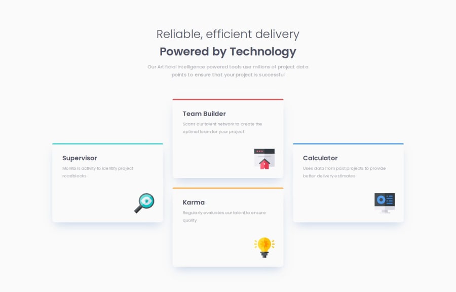
Responsive Four Card Feature Section using CSS Grid & Flexbox


Design comparison

Solution retrospective
I’m most proud of successfully implementing a responsive layout for this project. The design adjusts well across different screen sizes, ensuring a consistent user experience on mobile, tablet, and desktop devices. It was satisfying to see how well the grid layout came together in the final product.
Next time, I would plan the layout structure more thoroughly before diving into the code. While the solution works, I believe a more detailed layout plan could streamline the development process and potentially reduce the need for rework. I’d also like to explore using clamp() for responsive typography to make the text size transitions smoother.
This was my first time building with CSS Grid, and the layout presented some tricky challenges. Specifically:
- Positioning the cards accurately while maintaining responsiveness was challenging at first.
- Understanding how to use
grid-template-areasandgrid-template-rows/columnsefficiently took some trial and error.
To overcome these challenges, I referred to MDN Web Docs and practiced small, isolated grid examples to better understand how the properties worked. Breaking the layout into smaller sections and tackling them incrementally also helped simplify the process.
What specific areas of your project would you like help with?I’d appreciate any suggestions on:
- Improving the efficiency and readability of my CSS Grid code part.
- Optimizing the @media rules to make them more concise and scalable.

Join our Discord community
Join thousands of Frontend Mentor community members taking the challenges, sharing resources, helping each other, and chatting about all things front-end!
Join our Discord