Submitted 6 months ago
Responsive Four card feature section using CSS Grid
#sass/scss

P
@Negligence

Design comparison
SolutionDesign

Solution retrospective
What are you most proud of, and what would you do differently next time?
I learned to tweak and rename the design containers in figma to make it easier to translate it to html code structure.
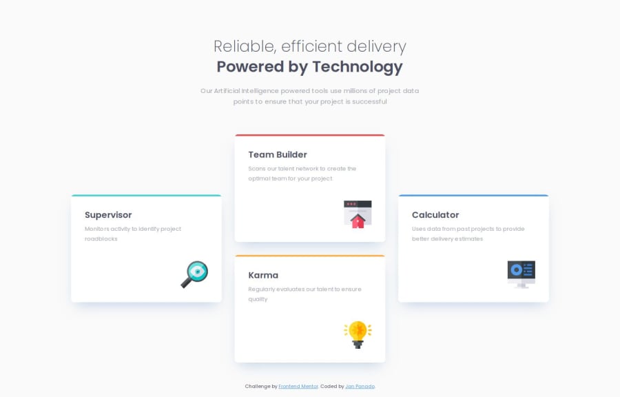
What challenges did you encounter, and how did you overcome them?Reliable, efficient delivery Powered by Technology Our Artificial Intelligence powered tools use millions of project data points to ensure that your project is successful Supervisor Monitors activity to identify project roadblocks Team Builder Scans our talent network to create the optimal team for your project Karma Regularly evaluates our talent to ensure quality Calculator Uses data from past projects to provide better delivery estimates
I found very enjoyable to create a shifting layout using the grid property.
.cards__container {
  gap: rem(30px);
  grid:
  "    .    t    .    "
  "    s    t    c    "
  "    s    k    c    "
  "    .    k    .    "
  ;
}
Community feedback
Please log in to post a comment
Log in with GitHub
Join our Discord community
Join thousands of Frontend Mentor community members taking the challenges, sharing resources, helping each other, and chatting about all things front-end!
Join our Discord