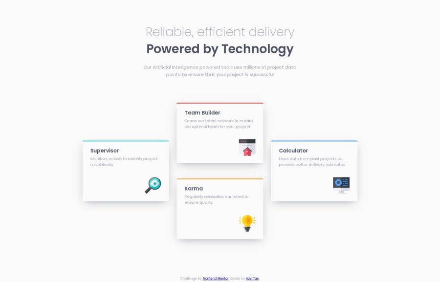
Responsive Four Card Feature section using CSS Grid
Design comparison
Solution retrospective
Any suggestions and feedbacks are highly appreciated. Thank you 😊
Community feedback
- @itushPosted over 1 year ago
Congratulations on completing the challenge! 🎉
Your solution looks nice to me :)
- It looks like you have submitted a different source code of a project with this challenge.
In my projects:
- I always start with mobile-first workflow.
- I use at least one main element for a page (entire content goes into the main, if I'm not using header & footer), and avoid divs as much as possible and use section and article element wherever I can.
<body> <main> All content </main> </body>
-
I Use relative units as much as possible and avoid absolute units whenever possible.
-
If you are someone who is just starting out with front-end development, I strongly suggest starting with the QR code component project(which you did). Also in the challenges page you may filter by (Newbie, HTML&CSS) sort by (easier first) to select projects that will help you solidify your foundation. To avoid any potential knowledge gap⚠️ please first solidify HTML, CSS, JS fundamentals and then move on to any framework or library.
-
I remember when I started out, I made countless mistakes and spent long hours searching for solutions. But hey, you don't need to go through the same struggles! 🙌 To help you shorten the learning curve, I recommend going through the following articles. They contain valuable insights that can make your journey smoother:
📚🔍 12 important CSS topics where I discuss about css position, z-index, box-model, flexbox, grid, media queries, mobile-first workflow, best practices etc. in a simple way.
📚🔍 11 important HTML topics where I discuss about my thought process and approach to convert a design/mock-up to HTML along with important topics like block and inline elements, HTML Semantic Elements.
I hope you find these resources helpful in your coding adventures! 🤞
I'm eagerly looking forward to seeing the amazing projects you'll create in the future! 🚀💻
Keep up the fantastic work and happy hacking! 💪✨
Marked as helpful0@azelalynetanPosted over 1 year ago@itush ops, sorry didn't noticed I pasted a different URL of my solution. I updated URL (https://github.com/azelalynetan/azel.frontend-mentor--four-card-feature-section). I was working on it yesterday midnight, looks like i'm sleepy when I submitted my solution.
Thank you very much for the feedback and tips. It is very helpful, I will take note all of it :)
1@itushPosted over 1 year ago@azelalynetan
No problem, I understand, this can happen to anyone 😁
You are most welcome!
I'm glad to see that my feedback was helpful for you.
Always happy to help :)
BTW: It would motivate me to provide quality support like this to the community, if you could spare a moment and give my GitHub pinned projects a ⭐️ star.
1
Please log in to post a comment
Log in with GitHubJoin our Discord community
Join thousands of Frontend Mentor community members taking the challenges, sharing resources, helping each other, and chatting about all things front-end!
Join our Discord