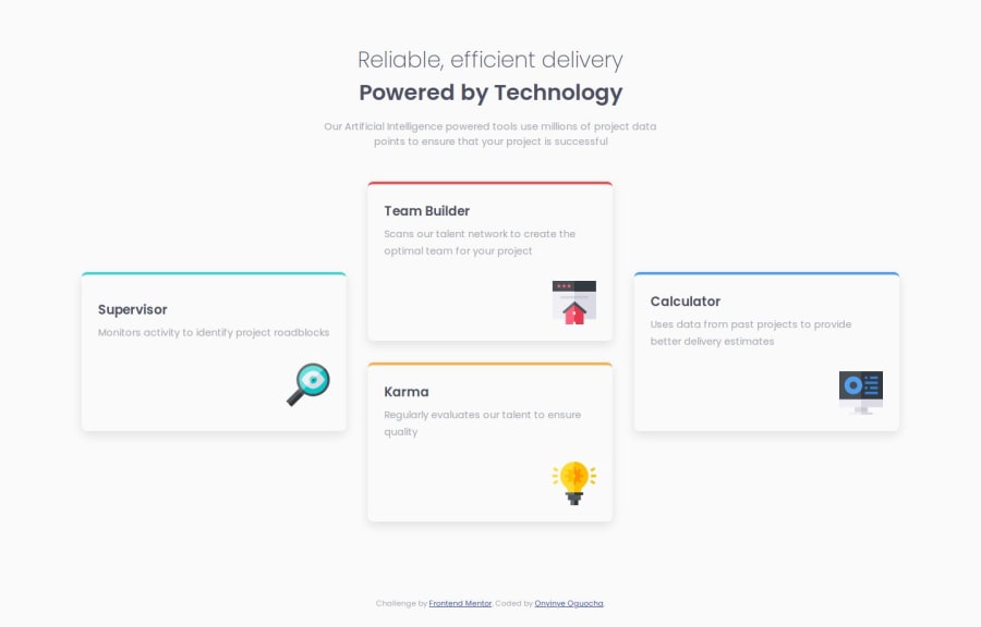
Design comparison
Solution retrospective
I’m proud of the responsive design and interactive hover effects that enhance user engagement.
Next time, I would prioritize accessibility features and consider using a JavaScript framework for better component management.
What challenges did you encounter, and how did you overcome them?This was my first time using CSS Grid, so I had to read up on it from W3Schools to understand its properties and functionalities. I overcame initial layout challenges by experimenting with different grid settings until I achieved the desired responsiveness.
What specific areas of your project would you like help with?I would appreciate feedback on enhancing accessibility features and optimizing the responsive layout further for different screen sizes. Additionally, guidance on best practices for organizing CSS and using a JavaScript framework like React would be helpful.
Community feedback
Please log in to post a comment
Log in with GitHubJoin our Discord community
Join thousands of Frontend Mentor community members taking the challenges, sharing resources, helping each other, and chatting about all things front-end!
Join our Discord
