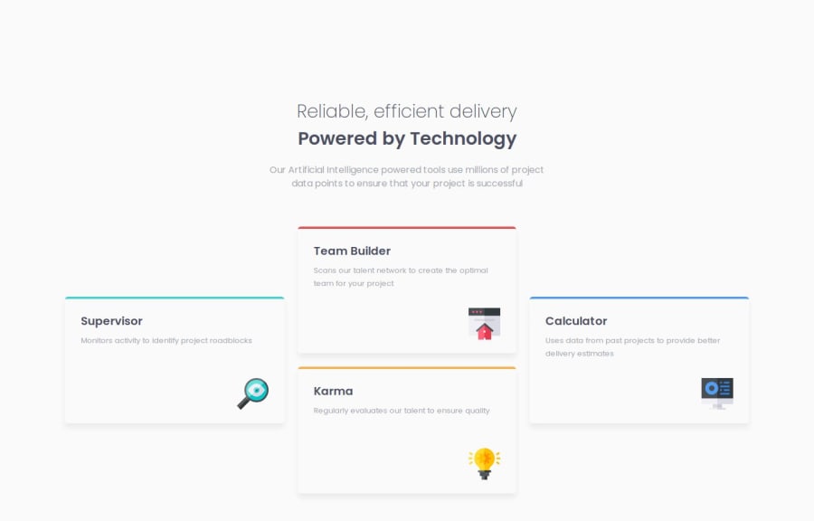
Responsive Four Card Feature Section


Design comparison

Solution retrospective
I am most proud of achieving this solution within a tight deadline. I set a short timeframe for myself and successfully completed the project without feeling overwhelmed.
However, next time I would like to take a bit more time to address some minor fixes and improvements. Instead of relying solely on a trial-and-error approach, I plan to allocate time for careful testing and refinement.
What challenges did you encounter, and how did you overcome them?I faced a challenge when trying to align the four cards horizontally for the desktop version of the layout. Initially, I struggled with ensuring that the cards displayed correctly without overlapping or misaligning.
To overcome this, I created a separate group for the two center cards, which allowed me to align them horizontally. By utilizing Flexbox features, I was able to adjust their positioning and spacing effectively.
What specific areas of your project would you like help with?I would appreciate guidance on alternative methods for aligning the cards in a responsive manner. If there are different techniques or best practices that could achieve a similar layout while enhancing responsiveness, I would love to learn about them.
Additionally, I am interested in tips for writing cleaner and more maintainable code. Any advice on structuring my CSS or utilizing SASS features more effectively would be greatly appreciated.
Community feedback
Please log in to post a comment
Log in with GitHub
Join our Discord community
Join thousands of Frontend Mentor community members taking the challenges, sharing resources, helping each other, and chatting about all things front-end!
Join our Discord