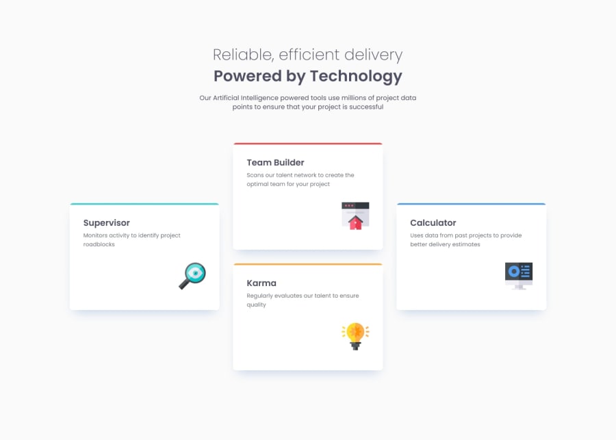
Design comparison
SolutionDesign
Solution retrospective
What are you most proud of, and what would you do differently next time?
Not much. I took way too long for such a simple result.
What challenges did you encounter, and how did you overcome them?I was not sure the best option to place the tiles between 2 lines.
What specific areas of your project would you like help with?n/a
Community feedback
- @Adhi-S12Posted 10 months ago
Good work and the site looks great, some things that can be improved are,
- The headers h1 and h2 should be centered in smaller screens
- In bigger screen size, you could have restricted the size of the paragraph tag below the h2, so that it does not span the entire row. You could have used max-width along with some character length like 60ch or something to achieve this.
- Could have reduced the card-description's font size a little so that it better matches the design.
1 - @RalphPastel972Posted 10 months ago
Thank you very much! for your feedback! I will have a look and improve things.
0
Please log in to post a comment
Log in with GitHubJoin our Discord community
Join thousands of Frontend Mentor community members taking the challenges, sharing resources, helping each other, and chatting about all things front-end!
Join our Discord
