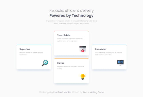
Submitted over 1 year agoA solution to the Four card feature section challenge
Responsive four card feature section solution
animation, bem
@anaiswritingcode

Solution retrospective
What are you most proud of, and what would you do differently next time?
In this project I implemented:
- BEM notation
- Custom CSS properties
- Media queries
- Mobile-first approach
- Semantic HTML
- Responsive design
- Grid areas
If I had to change something, I'd like to analyze the given design beforehand to figure out the least extensive route instead of jumping right into the CSS, this way I may be able to write less code than it's really needed.
What challenges did you encounter, and how did you overcome them?It was my first time using grid areas, but they were very straightforward so everything turned out fine!
What specific areas of your project would you like help with?I'd be interested in seeing different approaches to this challenge that contain less CSS.
Code
Loading...
Please log in to post a comment
Log in with GitHubCommunity feedback
No feedback yet. Be the first to give feedback on Ana Is Writing Code's solution.
Join our Discord community
Join thousands of Frontend Mentor community members taking the challenges, sharing resources, helping each other, and chatting about all things front-end!
Join our Discord