Submitted 4 months ago
Responsive four card feature section page with CSS Grid
#bem#semantic-ui

P
@hartashu

Design comparison
SolutionDesign

Solution retrospective
What are you most proud of, and what would you do differently next time?
Being introduced with CSS grid, make a complicated layout more achievable.
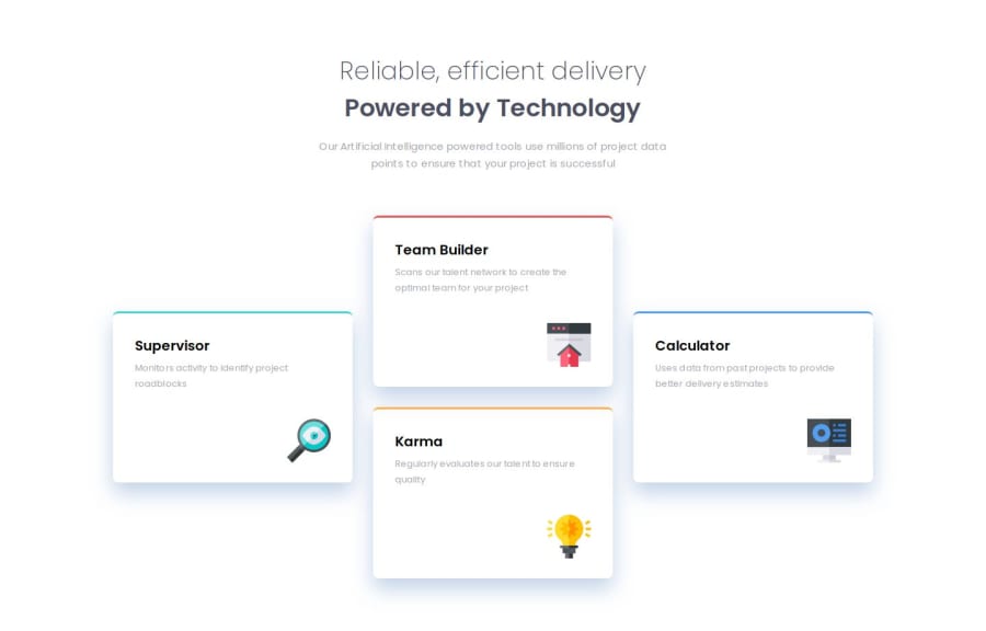
What challenges did you encounter, and how did you overcome them?The challenge I encountered: How to make the colorful line on the top of each card looks exactly the same as in the design. What I used right now is border-top property, but still has a slightly different.
What specific areas of your project would you like help with?Need to have more experience in:
- Semantics HTML in depth.
- Make an efficient, modular, maintainable CSS code to work with a team.
- BEM naming convention
Community feedback
- P@Bobstyle23Posted 3 months ago
Good job Harta! You can do better by changing the body's background color and by adding negative spread value to the box-shadow of -11px so it does not spread horizontally
0P@hartashuPosted 3 months ago@Bobstyle23 Hi Bob. Thanks for checking in. Okay, I will change the background color and the box shadow 👍
0

Please log in to post a comment
Log in with GitHubJoin our Discord community
Join thousands of Frontend Mentor community members taking the challenges, sharing resources, helping each other, and chatting about all things front-end!
Join our Discord