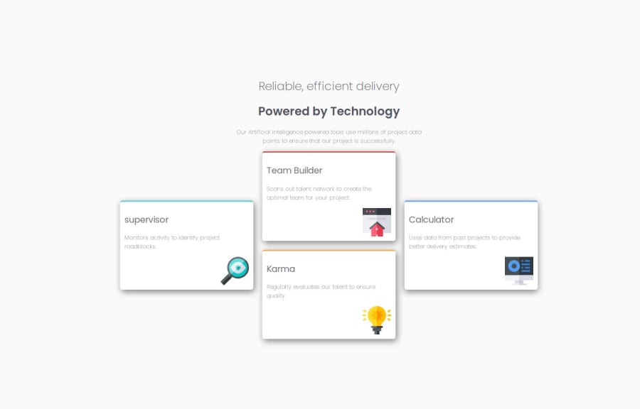
Design comparison
Solution retrospective
I learnt the use of CSS Grid. Probably further familiarize myself with the layout techniques I'm yet to use.
Please log in to post a comment
Log in with GitHubCommunity feedback
- P@anamaydev
Hey @Bluorde, congratulations on completing the challenge! I have a few suggestions I'd like to share.
HTML
- Consider using more semantic HTML elements where applicable like
<section>and<article>over<div>which enhances code clarity, accessibility, and SEO. Semantic tags improve navigation for screen readers and make code easier to read and maintain. - The use of multiple
<h1>tags is not recommended for SEO and accessibility. In your code you can use this
<h1> <span class="header-title-light">Reliable, efficient delivery</span><br> <span class="header-title-semi-bold">Powered by Technology</span> </h1>- On line number 35 you accidentally used
<P>instead of<p>
CSS
- Consider using CSS variables for colors used in multiple places. This makes future changes easier.
:root{ --red: hsl(0, 78%, 62%); --cyan: hsl(180, 62%, 55%); --orange: hsl(34, 97%, 64%); --blue: hsl(212, 86%, 64%); --very-dark-blue: hsl(234, 12%, 34%); --grayish-blue: hsl(229, 6%, 66%); --very-light-gray: hsl(0, 0%, 98%); }- CSS has significant redundancy, with repeated code across multiple classes. This can be simplified for easier maintenance and better readability. For example you have repeated styles for
.supervisor,.team-builder,.karma, and.calculator. You could create a shared class for common styles to reduce redundancy.
.card {
    background-color: #ffffff;
    padding: 10px 10px 25px 10px;
    border-radius: 5px;
    margin-bottom: 20px;
    box-shadow: 3px 5px 15px grey;
}

.supervisor { border-top: 3px solid #62d3d3; }
.team-builder { border-top: 3px solid #dd5958; }
.karma { border-top: 3px solid #f3af58; }
.calculator { border-top: 3px solid #6ca7e7; }
These are the mistakes I found in your project and made in my early projects. My peers provided feedback that helped me improve my code. Keep learning and working on new projects!
Marked as helpful - Consider using more semantic HTML elements where applicable like
- @Marcod01
Overall this is a good job on this project.
Your supervisor heading needs a capital S, always make sure that spelling and grammar is correct. If it helps you can copy and paste the text from the starter files. Also your heading should stand out compared to the text. The headings of your cards should have had a higher weight and been darker, this improves user readability.
You could use some more padding and margin as well. Giving your elements and headings proper spacing could make your site look much cleaner and it makes it easier to read.
Marked as helpful
Join our Discord community
Join thousands of Frontend Mentor community members taking the challenges, sharing resources, helping each other, and chatting about all things front-end!
Join our Discord
