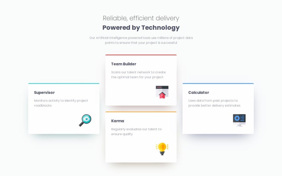
Design comparison
SolutionDesign
Solution retrospective
What are you most proud of, and what would you do differently next time?
making it similar to design
What challenges did you encounter, and how did you overcome them?hmm.. working with the four div
so i did it by using flexbox and insert the third box inside second box like nesting then by giving it margin-bottom did it 🙂
What specific areas of your project would you like help with?i wanna make it similar to design but is still is not cool 😔
Community feedback
Please log in to post a comment
Log in with GitHubJoin our Discord community
Join thousands of Frontend Mentor community members taking the challenges, sharing resources, helping each other, and chatting about all things front-end!
Join our Discord
