

Design comparison

Solution retrospective
First time working with somo new properties of flexbox.
What challenges did you encounter, and how did you overcome them?There is a moment between mobile design and desktop design that my sections lose proportions. I think it has to do with the flex but I can't figure it out.
What specific areas of your project would you like help with?I would appreciate if you could help me solve the problem mentioned above.
Community feedback
- P@CarlHummPosted 3 months ago
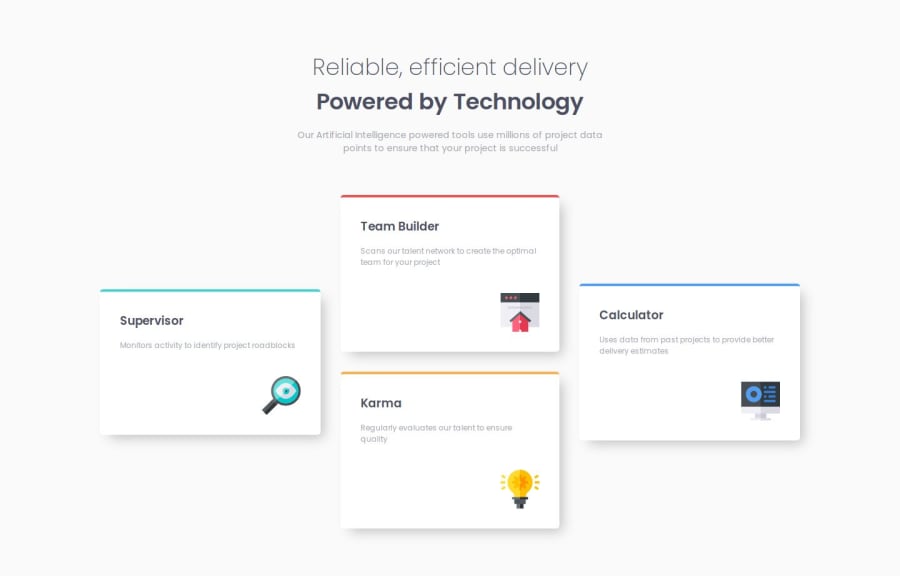
Hi k-hroma, I think I understand what you mean.
I assume when you say they 'lose proportions' you are refering to some cards appearing wider, or shorter than others towards the mobile/tablet viewport.
The default value for align-items is stretch. So normally flex children will stretch to fill 100% of the space of the parent container on the axis they are defined. Because you've set it to center, the items will instead center themselves and base their width and height values on their content instead.
If you look, the content differs from each card. Some paragraphs are longer or shorter than others. If you resize the browser you can see the paragraphs wrapping and unwrapping, causing different card widths.
You could solve this by giving the cards a relative width like 100% and then setting a max-width at different viewports. Or leave the alignment as stretch and instead center the parent container, and then change alignment for desktop viewports.
Apologies for the bad formatting, and good luck on your next challenge!
Marked as helpful0

Please log in to post a comment
Log in with GitHub
Join our Discord community
Join thousands of Frontend Mentor community members taking the challenges, sharing resources, helping each other, and chatting about all things front-end!
Join our Discord