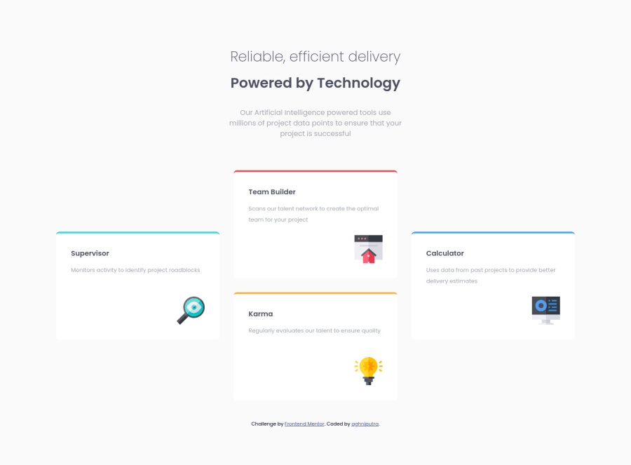
Design comparison
Solution retrospective
Hello, welcome to my solution :) If you notice, the corners of the colored border on the top of the cards look different from the design. I tried creating colored cards and gave it position: absolute property, and make them overlapped by the white cards with position: relative property, but it didn't work. I hope to hear suggestions so the cards look like those on the design. Or if you have any other suggestions or feedback about best practices, I'd love to hear them. Thank you :)
Community feedback
- @correlucasPosted over 2 years ago
👾Hello Aghnia, congratulations for your new solution!
About the colored borders, here's my tips for you:
I created these colored borders with
<span>and then I make it rounded. If you want to see how I build it using <span> and giving it aheightof 8px, here's my solution:https://www.frontendmentor.io/solutions/4-card-feature-section-vanilla-css-custom-design-glassmorphism-35MDUfOBdt
You can use this value for the card shadows:
box-shadow: 0 0.9375rem 2.625rem -0.6875rem rgb(131 166 210 / 40%);👋 I hope this helps you and happy coding!
1@aghniputraPosted about 2 years ago@correlucas Hi Lucas. I paid a visit to your solution page, it's amazing. Thank you so much for sharing. I'll make sure I'll try as you suggested :)
0
Please log in to post a comment
Log in with GitHubJoin our Discord community
Join thousands of Frontend Mentor community members taking the challenges, sharing resources, helping each other, and chatting about all things front-end!
Join our Discord
