

Design comparison
SolutionDesign

Solution retrospective
What are you most proud of, and what would you do differently next time?
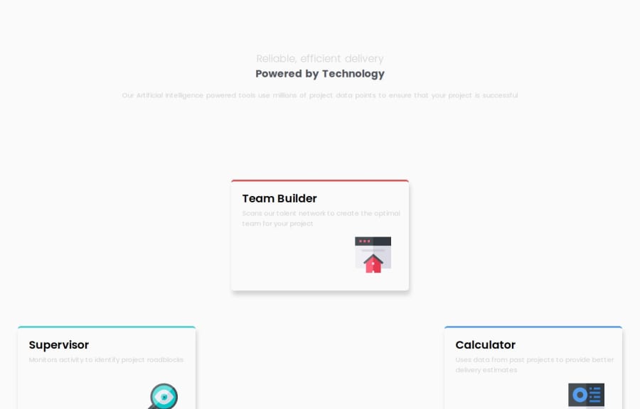
I love how I finally managed to put the text inside the cards in the top left corner and the icons in the bottom right corner.
What challenges did you encounter, and how did you overcome them?I struggled so much with positioning of the little details, like text and icons, but eventually figured it out doing some research.
What specific areas of your project would you like help with?I very happy with the mobile site but with the desktop site I have not managed to make it look just like the design. How do I bring the central 2 cards closer together? I have tried adding more rows and adjusting their star and end rows but it did not work.
Community feedback
Please log in to post a comment
Log in with GitHubJoin our Discord community
Join thousands of Frontend Mentor community members taking the challenges, sharing resources, helping each other, and chatting about all things front-end!
Join our Discord