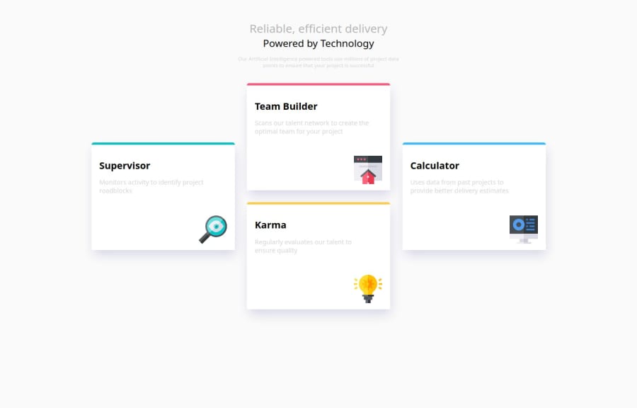
Responsive Four-Card Feature Layout with Mobile-First Design Using CSS
Design comparison
Community feedback
- P@MikDra1Posted 7 months ago
Nice one 😀
If you are curious how you can do this straight lines on the top of each card here is my tip:
Create another element in each of the cards. Then position this element absolute. Card should be positioned relative. At the end you need to give this element a height of 3px width of 100% and top 0 and left 0. You can also use ::after or ::before pseudo elements to create these.
Hope you found this comment helpful 💗
Good job and keep going 😁😊😉
1 - P@StroudyPosted 7 months ago
Amazing job with this! You’re making fantastic progress. Here are some small tweaks that might take your solution to the next level…
-
Using
vwandvhunits for container width and height can cause issues like content overflow, poor responsiveness, and inconsistent behavior across devices. These units don't account for browser chrome (like scrollbars) or user settings (such as zoom level), impacting accessibility and readability. On mobile devices, viewport changes can lead to layout shifts, degrading the user experience. Instead, consider using relative units (%), CSS Flexbox, Grid, or properties likemin-widthandmax-widthfor more adaptive, responsive designs that handle varying content and screen sizes better. -
This does not matter that much at this stage but something to be mindful of for SEO(Search Engine Optimisation),
<meta>description tag missing that helps search engine determine what the page is about, Something like this<meta name="description" content="" /> -
Using a
<main>tag inside the<body>of your HTML is a best practice because it clearly identifies the main content of your page. This helps with accessibility and improves how search engines understand your content. -
Using a naming convention like BEM (Block, Element, Modifier) is beneficial because it makes your CSS more organized, readable, and easier to maintain. BEM helps you clearly understand the purpose of each class, avoid naming conflicts, and create reusable components, leading to a more scalable codebase. For more details BEM,
-
Using
remoremunits in@mediaqueries is better thanpxbecause they are relative units that adapt to user settings, like their preferred font size. This makes your design more responsive and accessible, ensuring it looks good on different devices and respects user preferences.
You’re doing fantastic! I hope these tips help you as you continue your coding journey. Stay curious and keep experimenting—every challenge is an opportunity to learn. Have fun, and keep coding with confidence! 🌟
0 -
Please log in to post a comment
Log in with GitHubJoin our Discord community
Join thousands of Frontend Mentor community members taking the challenges, sharing resources, helping each other, and chatting about all things front-end!
Join our Discord
