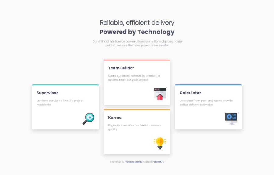
Design comparison
Solution retrospective
I'm proud of how the layout turned out to be and how responsive it is.
What challenges did you encounter, and how did you overcome them?Had some difficult with making my font-size responsive
Community feedback
- @AdrianoEscarabotePosted 6 months ago
Hello Bruno514, how are you? I was really pleased with your project, but I’d like to offer some advice that might help:
You have used <br> , using <br> is not only bad practice, it is problematic for people who navigate with the aid of screen reading technology. Screen readers may announce the presence of the element. This can be a confusing and frustrating experience for the person using the screen reader.
The rest is spot on.
Hope it’s helpful to you. 👍
Marked as helpful1@Bruno514Posted 6 months ago@AdrianoEscarabote Thank you for the suggestion and I’m glad you liked the solution! You are right, I actually used <br> as a lazy hack, and I will indeed not use it from now on.
0 - @marliedevPosted 6 months ago
I really like the solution! It adjust very good to the different screen sizes.
When it comes to responsive font-adjustments you can have a look at the clamp()-function
font-size: clamp(0.875rem, calc(1rem + 1vw), 2rem);And because i'm a big fan of structuring and naming: Have a look at BEM and SMACSS! Could really improve your work.
Marked as helpful1@Bruno514Posted 6 months agoThank you for the reply @marliedev! Very useful this way of using clamp and calc. I will also have a look at BEM and practice it more, I just didn’t find it much useful for such small projects like this one.
0
Please log in to post a comment
Log in with GitHubJoin our Discord community
Join thousands of Frontend Mentor community members taking the challenges, sharing resources, helping each other, and chatting about all things front-end!
Join our Discord
