Submitted 5 months ago
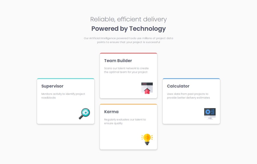
Responsive Four Card Feature component
#semantic-ui#accessibility
P
@SuhasPatnaik
Design comparison
SolutionDesign
Solution retrospective
What are you most proud of, and what would you do differently next time?
Getting the supervisor and calculator card to the vertical center of their respective columns was challenging for me. Also, feel like the CSS is pretty crispy on this project, really proud of that.
What challenges did you encounter, and how did you overcome them?Getting the supervisor and calculator card to the vertical center of their respective columns was challenging for me. My solution:
grid-row: 1/3;
align-self: center;
Code explanation:
- 1st line of code says that our element occupies the 1st and 2nd rows.
- 2nd line of code ensures that the element is positioned in the vertical center of the assigned space.
- Ensures it doesn't stretch fully from the top to the bottom of these rows, hence only taking up the necessary height for its content.
- Just general feedback in terms of best practises wherever needed would be great.
- I know from a web accessibility standpoint a lot of improvements can be made. Will be taking care of that in future projects.
Community feedback
Please log in to post a comment
Log in with GitHubJoin our Discord community
Join thousands of Frontend Mentor community members taking the challenges, sharing resources, helping each other, and chatting about all things front-end!
Join our Discord
