Design comparison
Community feedback
- @J-JawadPosted 8 months ago
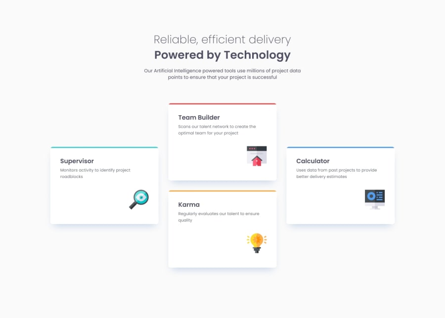
Your background color isn't the same, as well as the header font size for the cards. Font color of the paragraphs is much darker, and the side cards aren't really centered. Line height isn't accurate. These are little details that matter. You can easily avoid them by using the photo editor. Open the edit tab on the provided design images and use the crop tool to know the measurements of the elements you are adding (the measurements are shown in the crop box in pixels). You can also put the image on top of the website to check if you used the correct colors and shades.
1
Please log in to post a comment
Log in with GitHubJoin our Discord community
Join thousands of Frontend Mentor community members taking the challenges, sharing resources, helping each other, and chatting about all things front-end!
Join our Discord
