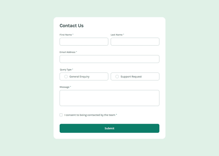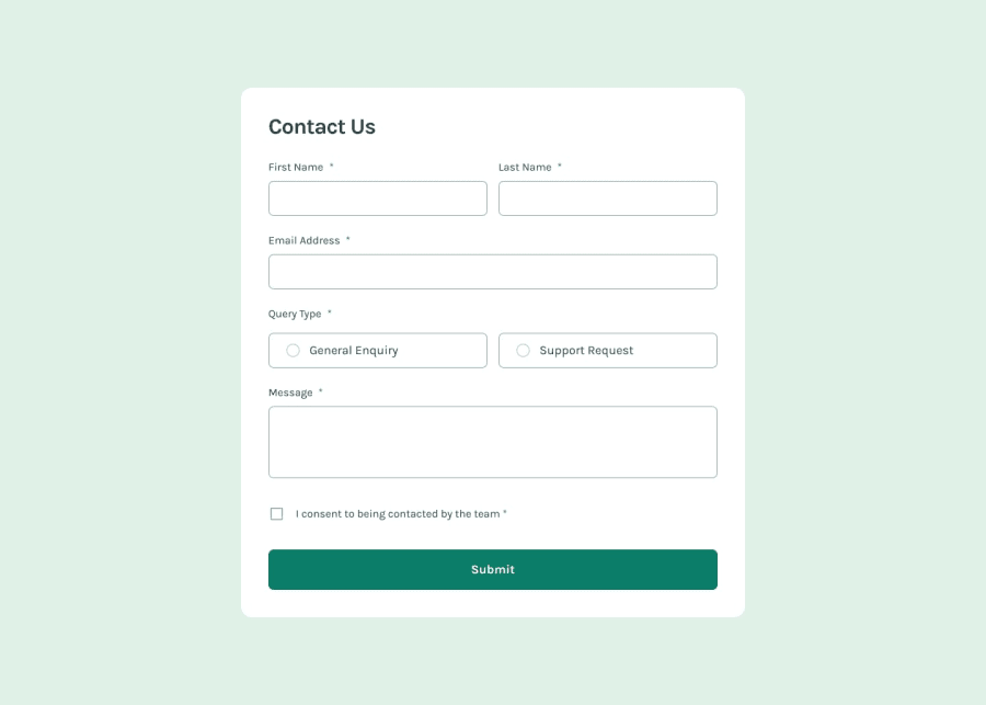
Design comparison
SolutionDesign
Solution retrospective
What are you most proud of, and what would you do differently next time?
I mostly learned how to style forms further, along with validation via JavaScript. I had done a smaller version of this before, but this was a bit more complicated as this had several elements to manage.
What challenges did you encounter, and how did you overcome them?I find that I struggle to remember how to style form elements often. With how common this seems to be I feel as though I should take some notes to refer to, as I find myself going back and having to research how to style certain elements repeatedly.
Community feedback
Please log in to post a comment
Log in with GitHubJoin our Discord community
Join thousands of Frontend Mentor community members taking the challenges, sharing resources, helping each other, and chatting about all things front-end!
Join our Discord
