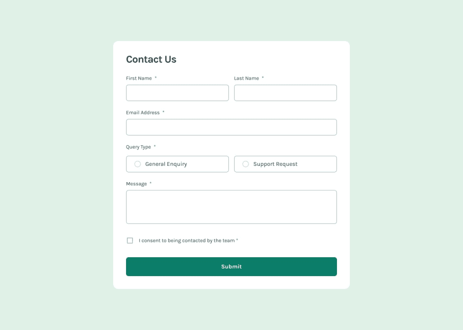
Design comparison
SolutionDesign
Community feedback
- @BettoRaitePosted 3 months ago
Good job, pretty impressive. Here is my feedback, tho. (Spoiler alert, I do it harsh). Things to improve:
- Add some side padding inside of input fields: first/last name, email.
- Fix gap between first/last name inputs.
- Add some top-margin to the error messages.
- Use rems for padding.
- Text inside of inputs does not have the design font.
- Submit button does not have the design font.
- Toast notification is not centered.
Things I hate:
- Every time I click on the inputs and refocus without typing, error messages pop up below the inputs.
0
Please log in to post a comment
Log in with GitHubJoin our Discord community
Join thousands of Frontend Mentor community members taking the challenges, sharing resources, helping each other, and chatting about all things front-end!
Join our Discord
