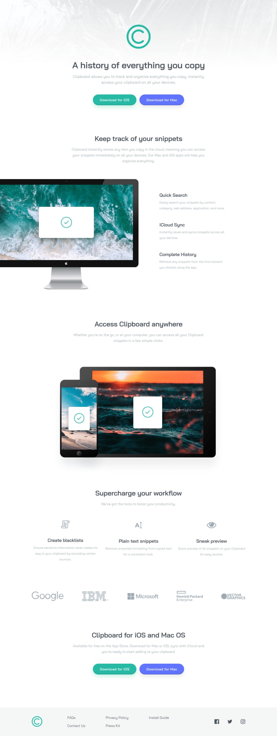
Responsive Typography and Spacings using min(), clamp(), and Calc().
Design comparison
Solution retrospective
Hello guys!
This is my first Junior level challenge. So far this is my 5th attempt at coding this challenge.
I've implemented a responsive typography and margins using using combination of clamp() and calc(). By which, the size of fonts and spacing increases directly proportional to the view port width without going too small or too wide. See below snippet for my H1 tag:
h1 { font-size: clamp(32px, calc((32 / 375) * 100vw), 46px); line-height: clamp(40px, calc((40 / 375) * 100vw), 57.5px); /* Clamps the value of letter spacing between -0.52px and -0.75px Inversely grows with viewport using the -1 multiplier*/ letter-spacing: calc(-1 * (clamp(0.52px, calc((0.52 / 375) * 100vw), 0.75px))); margin-bottom: 16px; }
The preferred value of clamp(): calc((32 / 375) * 100vw) simply means that starting at the viewport 375px, the font size 32px starts to grow directly proportional with the viewport until it reaches its upper limit which is 46px.
However, I cannot find a neat solution to adjusting a line-height inversely proportional to the viewport width using that approach. Have a look at my H3 style below.
h3 { /* As per design file, h3 is not responsive font */ font-size: 24px; line-height: 30px; letter-spacing: -0.39px; /* Margin grows inversely proportional with respect to viewport. Expressions in the 2nd parameter of clamp function were based on trial and error :) */ margin-bottom: clamp(8px, calc(10px - ((0.5 / 375) * 100vw)), 10px); }
At my H3, at smaller viewports margin-bottom should be 10px but on the larger viewport, it must be 8px(which means the margin shrinks as the viewport expands).
Can you suggest an easier way to implement a responsive margin where the margin shrinks as the viewport increases without compromising the design requirements?
Your answers mean a lot to me :) Thank you!
Community feedback
- @dod123-stackPosted almost 4 years ago
Good work.. your code helps me to learn some thing new. I hope to see more of your work in future..
1@juani2Posted almost 4 years ago@dod123-stack , Wow thanks! Right now really just focusing on responsive design.
0
Please log in to post a comment
Log in with GitHubJoin our Discord community
Join thousands of Frontend Mentor community members taking the challenges, sharing resources, helping each other, and chatting about all things front-end!
Join our Discord
