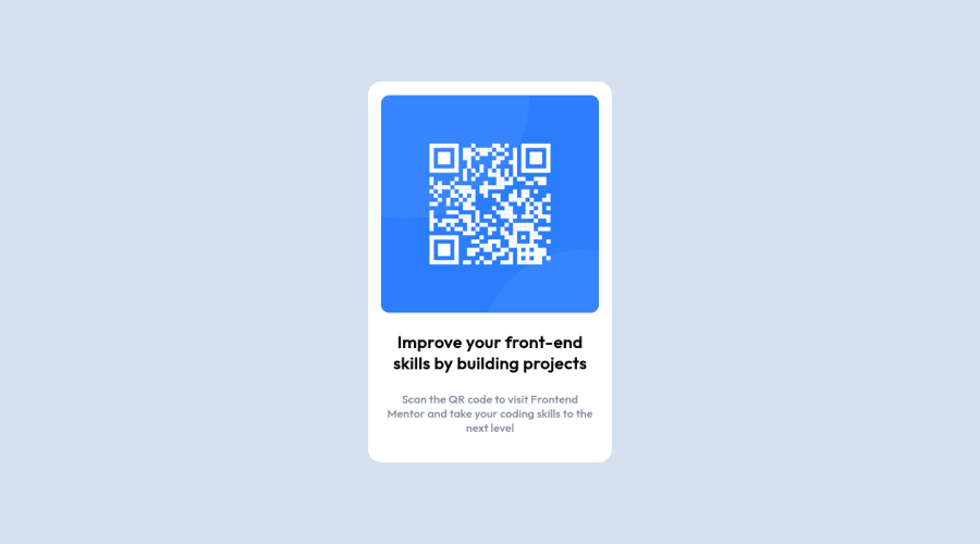
Design comparison
Solution retrospective
First time using Media Queries on a project, I Hope used it properly?
Community feedback
- @MelvinAguilarPosted about 2 years ago
Hi @modade97 ๐, good job for completing this challenge and welcome to the Frontend Mentor Community! ๐
Here are some suggestions to improve your code:
- Try to use semantic tags in your code. More information here:
With semantic tags:
<body> <main class="bcg_div"> . . . </main> <footer class="attribution"> . . . </footer> <body>
The
<body>
element contains all the contents of an HTML document- The tag <div> is used to defines a section in an website. It is used to have a container styled with CSS, set special alignment or the content needs a special positioning.
You could use more the <p> tag, the <p> element is paragraph level content, usually text
<p>Scan the QR code to visit Frontend Mentor and take your coding skills to the next level</p>
- Add a
<h1>
tag in your solution, The<h1>
element is the main heading in a web page. There should only be one<h1>
tag per page, and always avoid skipping heading levels; always start from<h1>
, followed by<h2>
and so on up to<h6>
(<h1>,<h2>,...,<h6>). The HTML Section Heading elements (Reference)
Solution:
<h1>Improve your front-end skills by building projects</h1>
-Remove
display: flexbox;
from the bcg_div selector,flexbox
is not a valid value for the display property- Remove
position: relative;
,top: auto;
,left: auto;
from the image - Use
max-width: 320px
tobcg_div
selector instead of width. - Use
min-height: 495px
tobcg_div
selector instead of height.
There is not much need to use media query in this challenge, unless you want to place the footer element somewhere on mobile devices. The component must not exceed the size if the min-height and max-width properties are used.
I hope those tips will help you.
Good Job and happy coding !
Marked as helpful1@vanzasetiaPosted about 2 years ago@MelvinAguilar
Hey there! That's good feedback and it would be better if you recommend using more modern CSS techniques to place the card in the middle of the page. Use either flexbox or grid instead.
I suggest taking a look at the "The Complete Guide to Centering in CSS | Modern CSS Solutions".
Marked as helpful1@modieeePosted about 2 years ago@MelvinAguilar thank you, this is the first project I have done that I've published for others to see, I'll be sure to practice using html semantics properly going forward and to properly use positioning as well, thanks for the link as well.
1 - @correlucasPosted about 2 years ago
๐พHi @modade97, congratulations on your solution!๐ Welcome to the Frontend Mentor Coding Community!
Great solution and a great start! From what I saw youโre on the right track. Iโve few suggestions for you that you can consider adding to your code:
- Use
<main>
instead of a simple<div>
this way you improve the semantics and accessibility showing which is the main block of content on this page. Remember that every page should have a<main>
block and that<div>
doesn't have any semantic meaning. - Replace the
<div>
containing the main title with<h1>
note that this title is the main heading for this page and every page needs one h1 to show which is the most important heading. Use the sequence h1 h2 h3 h4 h5 to show the hierarchy of your titles in the level of importance, never jump a level. - Add a margin of around
margin: 20px
to avoid the card touching the screen edges while it scales down. - Use relative units as
rem
orem
instead ofpx
to improve your performance by resizing fonts between different screens and devices. These units are better to make your website more accessible. REM does not just apply to font size, but to all sizes as well. - Donโt use
id
to give the style of your elements, it's not a good idea becauseid
is a too specific selector used forforms
and Javascript code. Instead, useclass
for styling and let theid
for much specific stuff. It's also not advisable to use IDs as CSS selectors because if another element in the page uses the same/similar style, you would have to write the same CSS again. Even if you don't have more than one element with that style right now, it might come later.
Here's my solution for this challenge if you wants to see how I build it: https://www.frontendmentor.io/solutions/qr-code-component-vanilla-cs-js-darklight-mode-nS2aOYYsJR
โ๏ธ I hope this helps you and happy coding!
Marked as helpful0 - Use
- @vanzasetiaPosted about 2 years ago
Hello, Modadeoluwa! ๐
Congratulations on finishing this challenge! ๐
In this case, there's no need for media queries to make the site responsive. Also, there's no need for relative and absolute positioning.
Here are some suggestions for improvements.
- There should not be text in
span
anddiv
alone whenever possible. Instead, wrap the text with a meaningful element like a paragraph element. - The alternative text should not contain the word "image". Also, it should describe what will happen when the user scans the QR code.
- Don't use
id
to select an element to style. Prefer single-class selector whenever possible. - To place the card in the center of the page, I recommend using flexbox or grid. These modern techniques are more robust than absolute positioning and require less code to implement.
- The card or the
#bcg_div
only needs amax-width
to be responsive. There's no need to set aheight: auto
.
I hope this helps! Happy coding!
Marked as helpful0 - There should not be text in
- @modieeePosted about 2 years ago
@vanzasetia @correlucas @MelvinAguilar I want to appreciate you all for you feedbacks and corrections, i have applied them and would like you all to yake a look once more. Thank you.
2@vanzasetiaPosted about 2 years ago@modade97
I recommend making the
body
element a flex container to center the card. After that, usemin-height
instead ofheight
on thebody
element. This way, if the card needs more than100vh
, thebody
element can grow.Then, use the
main
element as the card element. There's no need for additionaldiv
. In fact, there's no need fordiv
at all.Marked as helpful1
Please log in to post a comment
Log in with GitHubJoin our Discord community
Join thousands of Frontend Mentor community members taking the challenges, sharing resources, helping each other, and chatting about all things front-end!
Join our Discord