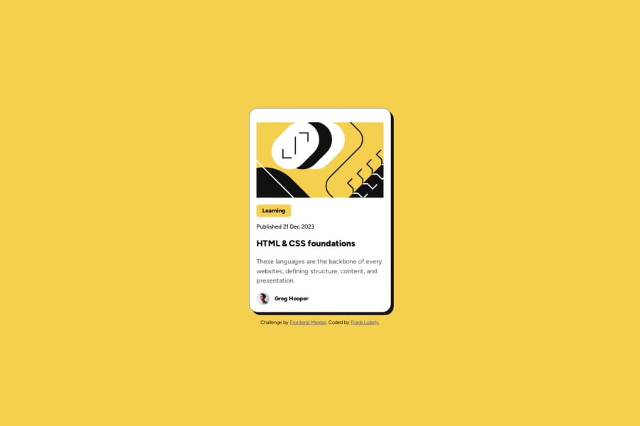
Design comparison
Solution retrospective
I'm proud of the challenge. What to do differently is the rounded corners of the image which I found challenging.
What challenges did you encounter, and how did you overcome them?The rounded corners of the SVG were the challenge for which I couldn't find a solution yet. I need help with that or resources that couldn't assist me.
What specific areas of your project would you like help with?SVG rounded corners on the challenge design, which I couldn't resolve.
Community feedback
- @aguscorvoPosted 7 months ago
Good job on solving the challenge! I saw that you already fixed the rounded corners on the illustration image—well done!
Here are some suggestions to improve the solution or tips moving forward:
- The title is missing a hover state.
- How about changing the p tag with the class title to an h1 tag?
- Instead of adjusting margins or using unnecessary padding on each element, you could use display: flex and gap. This approach also makes it easier to match the designs. When you start styling components, you’ll notice the benefits of this.
- For future projects, if you have the chance to check the Figma designs, take advantage of it to ensure the sizes and other properties match.
- I’m following the “Getting started on Frontend Mentor” path, and there’s an interesting challenge: “The font sizes in this project are slightly smaller in the mobile layout. Find a way to reduce the font size for smaller screens without using media queries.” It’s fun to solve!
- One more tip for future projects: folders that start with a dot, like .vscode, are generally not meant to be included in the repo. I suggest adding them to the .gitignore file to avoid issues when working with other developers.
Marked as helpful0@franklobsty25Posted 7 months ago@aguscorvo Thank you for the feedback. I am grateful and will do what was suggested.
1 - P@Jan-Dev0Posted 7 months ago
Looks good overall! Here are a few suggestions for improvement:
- The illustration image is missing a border-radius
- Consider using an <img> element for the illustration instead of an inline SVG. This could simplify your HTML and maintain better separation between content and styling.
- Also the hover effect is currently missing.
Great job so far, and keep up the good work!
Marked as helpful0
Please log in to post a comment
Log in with GitHubJoin our Discord community
Join thousands of Frontend Mentor community members taking the challenges, sharing resources, helping each other, and chatting about all things front-end!
Join our Discord
