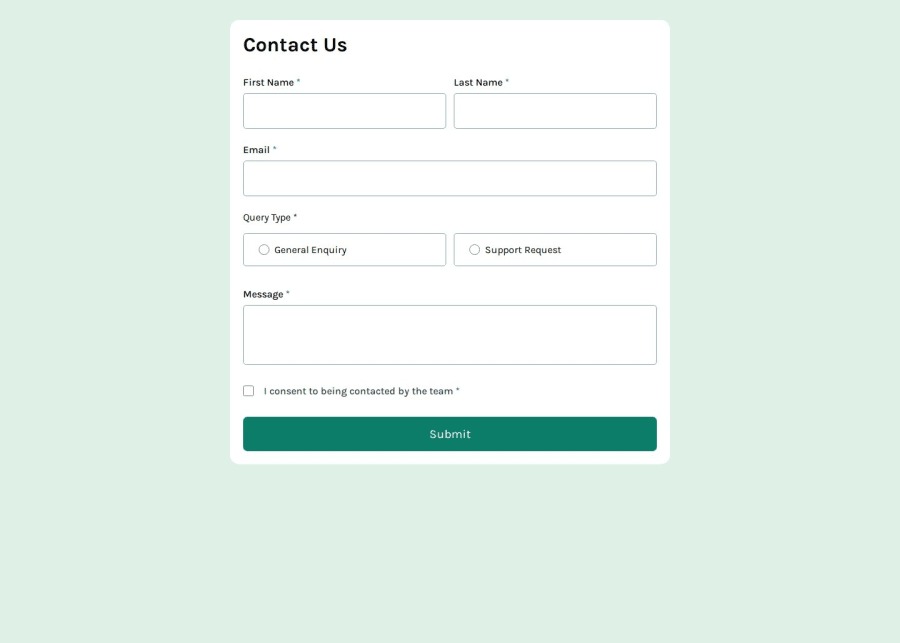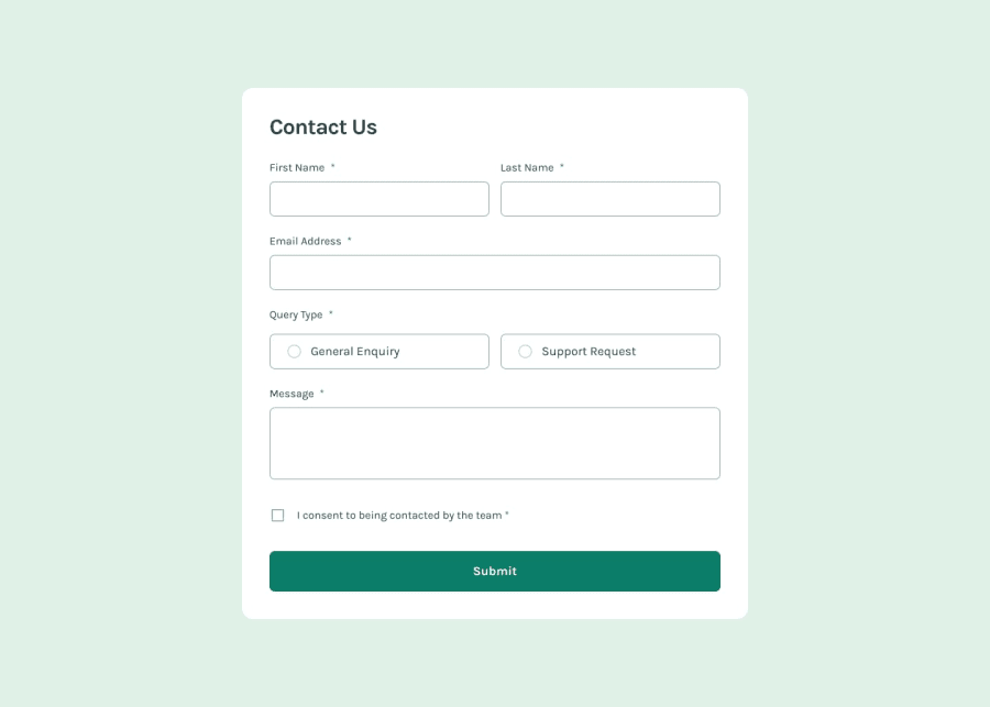
Design comparison
Solution retrospective
I am to have been able to easily create the layout and the form validation.
What challenges did you encounter, and how did you overcome them?I didn't have any challenges with this project
What specific areas of your project would you like help with?Any suggestions on how to improve the css and the js are appreciated :)
Community feedback
- P@elisilkPosted 6 months ago
Hi 👋 @poissonfou,
Congrats on a very nice solution. 👏 The solution looks a lot like the design and functions very well. I also appreciate that you focused on the accessibility of the form. Great job!
If you are up for diving in just a little further 🤿, I'd suggest a few things:
- First, to get your
<main>container centered in the viewport, I'd suggest a few changes. First, I'd take off themargin-leftand thetransformCSS attributes you currently have. Instead, I'd suggest just setting themax-widthto constrain how big it can get in the larger screens. Then, I'd suggest setting its container, the<body>element, to be the full height of the viewport and be a flex container so that it's relatively easy to center the<main>element both horizontally and vertically usingalign-itemsandjustify-content. All together, here is what the solution would look like:
body { min-height: 100vb; /* so will take up at least the full viewport height */ display: flex; align-items: center; /* centers child items vertically */ justify-content: center; /* centers child items horizontally */ } main { max-width: 46rem; /* so will take up no more than 736px */ }-
Second, I noticed when using the keyboard to access your form that the two radio buttons weren't connected. That is, when I can hit
taborshift+tabto go from one to the other, but usually when they are connected you should move between them using the arrow keys instead (see https://webaim.org/techniques/keyboard/#testing). And then I noticed that you have a JavaScript functionselectRadioInputthat looks for the ratio options and makes sure only one is checked at a time. Instead of that approach, if you make them part of one radio group then that gets taken care of automatically. To make them part of the same group, all you have to do is change your HTML so that they have the samenameattribute. See this MDN reference: https://developer.mozilla.org/en-US/docs/Web/HTML/Element/input/radio#defining_a_radio_group -
And finally, I also noticed you are using the built-in form validation. That is definitely a workable way to go. But the design (and your HTML) calls for more custom messages that you show up below the input fields (into your
.form__errorelements). Although a bit more work, you might try to implement those more custom messages. If you are up for giving this a try, I suggest looking at the "A more detailed example" section in this MDN guide as a useful starting point: https://developer.mozilla.org/en-US/docs/Learn/Forms/Form_validation#validating_forms_using_javascript
Anyway, just some ideas to consider if you are thinking about improving on this solution. 🤔
Happy coding. 💻
Eli
0 - First, to get your
Please log in to post a comment
Log in with GitHubJoin our Discord community
Join thousands of Frontend Mentor community members taking the challenges, sharing resources, helping each other, and chatting about all things front-end!
Join our Discord
