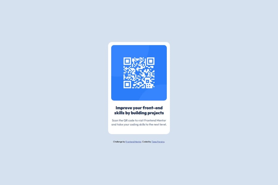
Design comparison
SolutionDesign
Community feedback
- @tlebelPosted about 1 month ago
- good work!
- good idea to isolate styles in
style.css
Minor issues:
- I noticed the mobile version sticks to the edges, you could technically just remove your
(min-width: 576px)media query. - the card drop shadow is missing
Otherwise, some possible micro optimizations:
- semantic html could have been used (article, figure, header, section, etc.) for building the card
- when loading the font you can spare bytes by loading only the 2 weight used in the page (
500;700):https://fonts.googleapis.com/css2?family=Outfit:wght@500;700&display=swap
0
Please log in to post a comment
Log in with GitHubJoin our Discord community
Join thousands of Frontend Mentor community members taking the challenges, sharing resources, helping each other, and chatting about all things front-end!
Join our Discord
