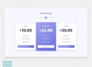
Design comparison
SolutionDesign
Solution retrospective
I would really like feedback as the button get spilted into two row at 1000px
Community feedback
- @rcspringerPosted about 3 years ago
Hi Kabeer! Nice job on the design. To answer your question on why the button is split in two is because of the default style of the <a> element. 2 ways to solve this:
- Use a button instead of a <a>
- add display: inline-block to the style of the <a> (The rest of the styling should be adjusted because this will also break some CSS)
Marked as helpful0@kabeer-progPosted about 3 years ago@rcspringer Thank you so much. I really appreciate it. I am working to resolve the issue based on your recommendation
0
Please log in to post a comment
Log in with GitHubJoin our Discord community
Join thousands of Frontend Mentor community members taking the challenges, sharing resources, helping each other, and chatting about all things front-end!
Join our Discord
