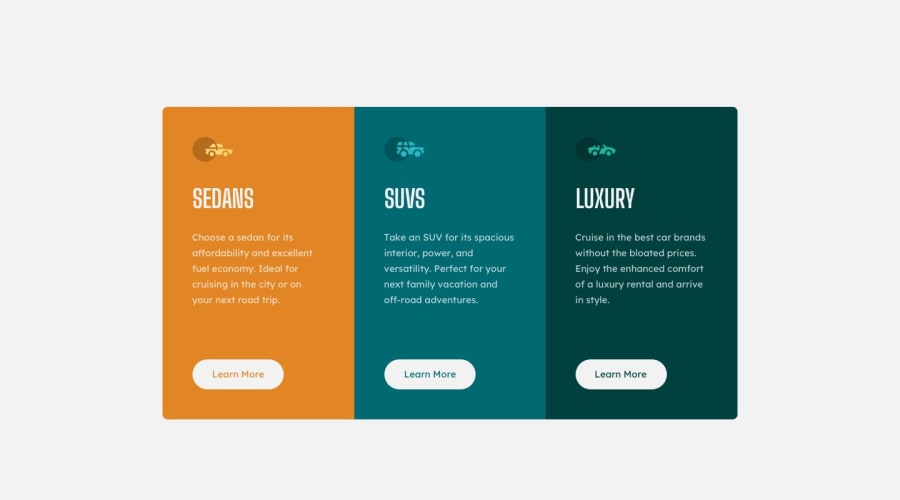
Design comparison
Solution retrospective
I am wondering if there is a more efficient way to program the buttons. I gave them a general class but then had to use IDs when styling the individual colours and hover behaviours. I feel like there would be an easier way for this.
Community feedback
- @nilanshu96Posted over 3 years ago
Your solution looks pretty good. For button the better solution would be to use the following for hover
.learn-more-button:hover {
    background-color: transparent;
    color: var(--very-light-gray);
}
For this to work you need to add a 1px solid white border on the button's class by default so that you won't have to add it separately for hover. Since the border and button's background would have the same color it won't be visible in button's normal state.
1@Tyson-WellingsPosted over 3 years ago@nilanshu96 Ohhh that makes alot of sense. Thank you! So for the regular states there isn't a more elegant solution for the text color?
0@nilanshu96Posted over 3 years ago@Tyson-Wellings I was doing the exact same research during this challenge. The solutions I found involved using some very modern css which isn't supported everywhere hence I left it but this is the solution I found.
.learn-more-buttons {
    mix-blend-mode: screen;
    color: black;
}
To understand how this works you can checkout this site: link
0@Tyson-WellingsPosted over 3 years ago@nilanshu96 That's a very creative solution. Thank you! I also appreciate you sending the link too :)
0 - @tedikoPosted over 3 years ago
Hello, Tyson! 👋
Good effort on this challenge! Everything works good and responds well. In addition to both nilanshu and brasspetals feedback I'd suggest you to take a look at:
- Change the
altattributes for the.leading-vector-imagesicon images, as they don't add any extra context for screen reader users. Since your images are decorative youralttext should be provided empty (alt="") so that they can be ignored by assistive technologies. - Change
width: 300pxfor your.column-cardon mobile to100%. This way your container will be growing with screen size. Now your solution is only looking good on mobile/desktop.
Good luck with that, have fun coding! 💪
0@Tyson-WellingsPosted over 3 years ago@tediko Thank you for taking the time to provide such thorough feedback. The alt text point is very new to me and makes alot of sense! Changing the column-card width to a percentage unit also does make sense in making my solution more responsive.
0 - Change the
- @brasspetalsPosted over 3 years ago
Hi, Tyson! Congrats on submtting another solution! 🎉 It looks good and responds well.
I'm seconding Nilanshu's solution to the button styling. I do have a small suggestion concerning those buttons, however. They're actually "button-styled links" rather than buttons, as they don't have any button functionality. Switching
buttonout foratags instead would be more semantically correct. This is a very common mistake, which I've been guilty of myself in the past! 😅0@Tyson-WellingsPosted over 3 years ago@brasspetals Good catch! I'll be sure to use <button> next time instead of a tags.
0
Please log in to post a comment
Log in with GitHubJoin our Discord community
Join thousands of Frontend Mentor community members taking the challenges, sharing resources, helping each other, and chatting about all things front-end!
Join our Discord
