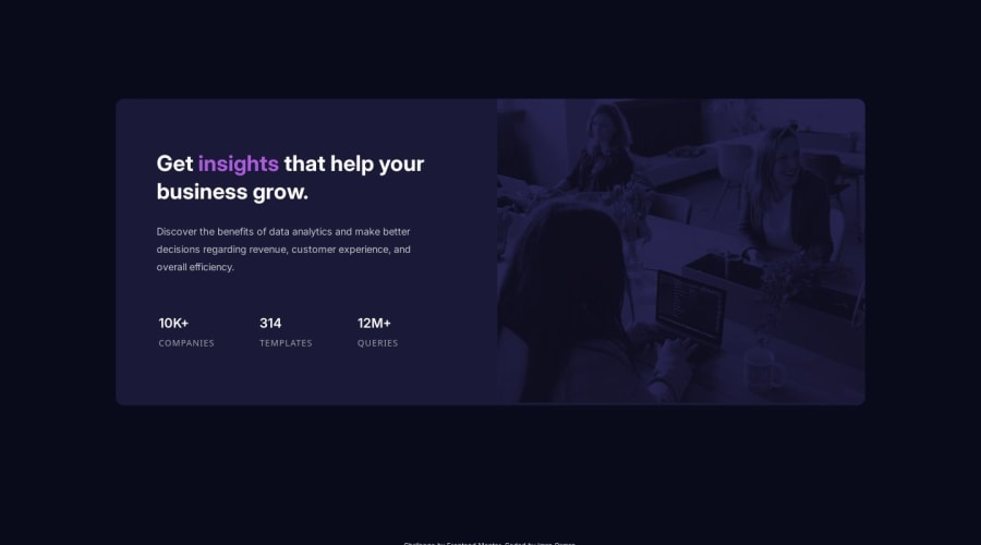


Design comparison

Solution retrospective
I'm proud of my comfortability with these layouts now. While I still face some challenges, I'm confident approaching them and trust that I can make a good quality, responsive design.
I think I'm over the mobile-first workflow. It tends to make me underestimate how much work there is to do in the desktop version (even if it's not much), and I don't plan my HTML as well as I could. I enjoyed a desktop-first approach when I started out with it, so I might revert back. I also mainly navigate sites on desktop, too so I think as a user it makes more sense to me to design this way. I'm open to changing it again in future, though.
What challenges did you encounter, and how did you overcome them?I wasn't able to make the blend-mode on the image card match the design. I felt like I got close but couldn't figure it out, even with research. I used blend-mode properties and opacity to get this close, but it's still too dark.
I'd like feedback on my Sass, if there's anything I could add/adjust. I'm comfortable writing it, but I don't think I'm using it to its full potential. This is mostly because I don't always know what the project will entail so I don't make intentions to necessarily create mixins or variables as readily. (Also my documents are pretty short at this stage, still.) I namely just use nesting without thinking about it too much, which I enjoy.
-
Please help with the image filter and how to make it match the lighter design.
-
Please also help with the tiny gap underneath the image in the card. I couldn't figure out how to remove this and I think I've been able to in the past with similar briefs but I couldn't in this instance! It must be simple?
Please log in to post a comment
Log in with GitHubCommunity feedback
No feedback yet. Be the first to give feedback on IO's solution.
Join our Discord community
Join thousands of Frontend Mentor community members taking the challenges, sharing resources, helping each other, and chatting about all things front-end!
Join our Discord