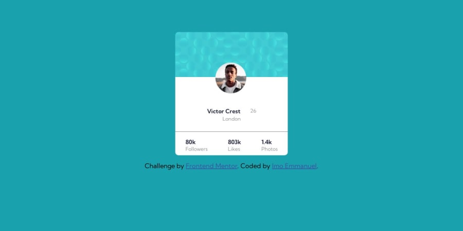
Design comparison
Solution retrospective
I could not add the background image to the background. I will appreciate if I am shown a better to make it work.
I am unsure of the way I added the profile picture and would appreciate best practice too.
Community feedback
- @Caius-ScipioPosted over 1 year ago
Great job on completing the challenge! The background images also gave me issues. What helped me complete my challenge was adding this line to the body style:
body {
background: url(../images/bg-pattern-top.svg) bottom [##]vh right [##]vw no-repeat, url(../images/bg-pattern-bottom.svg) top [##]vh left [##]vw no-repeat;
}
Just play around with the numbers to get it just right and you should be golden.
Additionally, it appears that the centering is a bit off. I found using these lines in the body to be really effective:
body {
display: grid;
place-items: center;
}
You can still use flexbox in other areas. I did. Again, great job and keep practicing!
Marked as helpful0
Please log in to post a comment
Log in with GitHubJoin our Discord community
Join thousands of Frontend Mentor community members taking the challenges, sharing resources, helping each other, and chatting about all things front-end!
Join our Discord
