Design comparison
Solution retrospective
Hi everyone, What advice do you have for optimising my code?
Community feedback
- @juliankrugerPosted almost 3 years ago
Hi Maria,
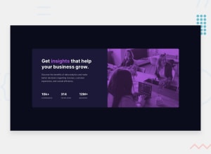
that actually looks really nice! You got really close with the color and the properties, it looks good. The mobile version is a bit slim and also it holds its size as the screen gets bigger. It would be nice if it kinda grew naturally to a certain point to that it looks nice on a tablet for example. With that issue I think usually a mobile-first approach helps: Design it for mobile first, add desktop complexity later. I wouldn't suggest rebuilding this, though, but maybe consider it for future challenges.
The only real issues at hand are the 3 accessibility issues in the report. One advice for the one with the h3 headings: I'd say these are not even headings, they only look like headings. For example, "10k+" taken for itself is not a heading from a content perspective. I'd personally assign them to paragraphs with spans to style them differently. But that's probably up for debate. If these are used as headings, though, the heading would be the whole "10k+ companies".
Greetings!
Marked as helpful1
Please log in to post a comment
Log in with GitHubJoin our Discord community
Join thousands of Frontend Mentor community members taking the challenges, sharing resources, helping each other, and chatting about all things front-end!
Join our Discord
