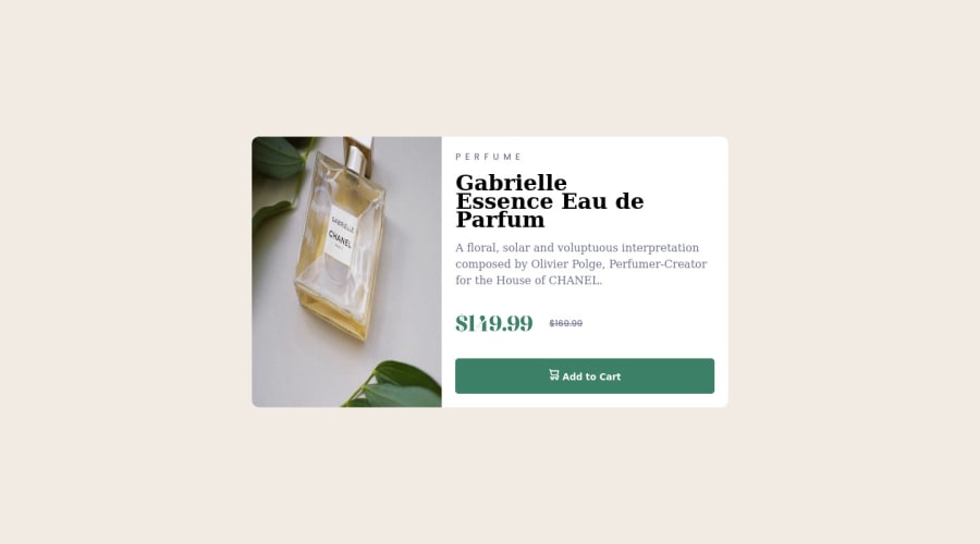
Design comparison
SolutionDesign
Solution retrospective
if you have any feedback or suggestions please write a comment i will read all
Community feedback
- @hyrongennikePosted about 2 years ago
Hi @abdeldevprojects,
Congrats on finishing another challenge below are just a few improvements you can make. To get the columns to be equal you can use the below code on the container.
    display: grid;
    grid-template-columns: 1fr 1fr;
    margin: 0 auto;
}```

then just add `object-fit: cover` to the image on the left so that it doesn't appear stretched. You can also remove the max-width from the product title and just increase the font size and also increase the padding around the content on the right.
Marked as helpful0@abdeldevprojectsPosted about 2 years ago@hyrongennike Thank you so much for your feedback <3
1
Please log in to post a comment
Log in with GitHubJoin our Discord community
Join thousands of Frontend Mentor community members taking the challenges, sharing resources, helping each other, and chatting about all things front-end!
Join our Discord
