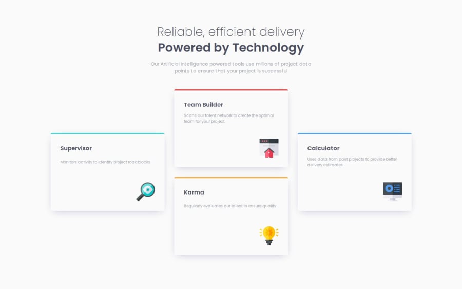
Responsive feature section using grid
Design comparison
Community feedback
- @petrakowwwPosted 7 months ago
I really liked the implementation of the site adaptation depending on the screen zoom change. Initially, I did not know how to do this correctly using Flexbox, and the result did not come out as I had planned. Now I understand that it's worth studying Grid and rewriting some of the layout and styles. Thank you for your example — it has become a great reference point.
I also noticed that you used Gulp and other tools to work, it's impressive! I wish you success in your future projects!
0
Please log in to post a comment
Log in with GitHubJoin our Discord community
Join thousands of Frontend Mentor community members taking the challenges, sharing resources, helping each other, and chatting about all things front-end!
Join our Discord
