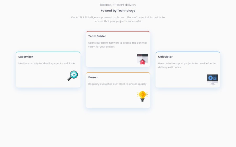
Design comparison
Solution retrospective
I'm proud to have been able to create this design so quickly and to have used the Sementic tag.
What challenges did you encounter, and how did you overcome them?Nothing to note
What specific areas of your project would you like help with?I'm not sure I got the same shadow effect.
Community feedback
- @dvdgdPosted 11 months ago
Hey, great work completing this challenge, your HTML looks semantic and you achieve the main concern of placing the grid.
Just one thing that I am noticing is there you are using
pxunit for your font-sizes. Prefer to use rem for your site be readable in larger screens and also small too. You can learn more about the rem unit and how to use it from here. Also, I always use a site to convertpxvalues to a closerem, I can not recommend using it too.PLUS: You can set the max-width for your cards to
~23rem, this will prevent it to grow as the width grows too.Again, your HTML is pretty good, keep it up with this awesome work.
Marked as helpful0 - @RegexRiddlerPosted 12 months ago
Your HTML markup is semantic and readable :)
Your CSS is fine but if you where a little more consistent on your spacing and indentation it would be more readable.
Last tip I have for you is about your CSS grid. You have 6 columns and 4 rows.
section {
    grid-template-columns: repeat(6, 1fr);
    grid-template-rows: repeat(4, 1fr);
}
But you only need 3 columns and 2 rows, then use align-self: center on the left and right card.
section { grid-template: repeat(2, auto) / repeat(3, auto); } article:nth-of-type(1), article:nth-of-type(4) { grid-row: span 2; align-self: center; } article:nth-of-type(2) { grid-area: 1 / 2; } article:nth-of-type(3) { grid-area: 2 / 2; }0
Please log in to post a comment
Log in with GitHubJoin our Discord community
Join thousands of Frontend Mentor community members taking the challenges, sharing resources, helping each other, and chatting about all things front-end!
Join our Discord
