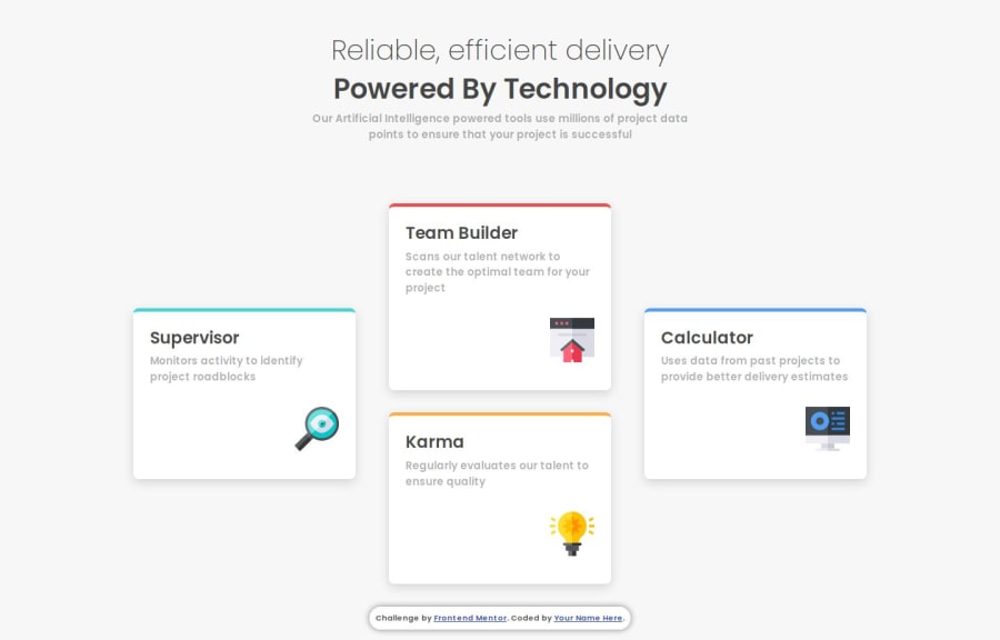
Design comparison
Solution retrospective
The Time I spend building the main Layout is Decraesing every time I finish a Project, I'm really proud that I'm Actually learning Something and Leveling up My Skills.
What challenges did you encounter, and how did you overcome them?Nothing Was that hard as i actually practice some of my previous challenges regularly
What specific areas of your project would you like help with?Nothing as of now
Community feedback
- @StroudyPosted about 2 months ago
Amazing job with this! You’re making fantastic progress. Here are some small tweaks that might take your solution to the next level…
-
body { font-size: 15px; }
Whilepx
is useful for precise, fixed sizing, such asborder-width
,border-radius
,inline-padding
, and<img>
sizes, it has limitations. Pixels don't scale well with user settings or adapt to different devices, which can negatively impact accessibility and responsiveness. For example, usingpx
for font sizes can make text harder to read on some screens, Check this article why font-size must NEVER be in pixels. In contrast, relative units likerem
and adjust based on the user’s preferences and device settings, making your design more flexible and accessible. Usepx
where exact sizing is needed, but prefer relative units for scalable layouts. If you want a deeper explanation watch this video by Kevin Powell CSS em and rem explained. Another great resource I found useful is this px to rem converter based on the default font-size of 16 pixel. -
Using
rem
orem
units in@media
queries is better thanpx
because they are relative units that adapt to user settings, like their preferred font size. This makes your design more responsive and accessible, ensuring it looks good on different devices and respects user preferences. -
Using a full modern CSS reset is beneficial because it removes default browser styling, creating a consistent starting point for your design across all browsers. It helps avoid unexpected layout issues and makes your styles more predictable, ensuring a uniform appearance on different devices and platforms, check out this site for a Full modern reset
You’re doing fantastic! I hope these tips help you as you continue your coding journey. Stay curious and keep experimenting—every challenge is an opportunity to learn. Have fun, and keep coding with confidence! 🌟
Marked as helpful0 -
- @NikitaVologdinPosted about 2 months ago
Awesome pixel perfect. Just for perfection want to suggest to change font-sizes according design of desktop version.
Marked as helpful0 - @juan-mentorPosted about 2 months ago
-
Hola Mohamed, tu solución de las cuatro tarjetas es muy buena, sobre todo por que la has construido con una tremenda precisión ( casi de cirujano ). Lo que más me ha llamado la atención es que te has decantado por utilizar flex, que para este diseño no era nada fácil de hacer.
-
También he tomado nota de todas las consultas de medios que tienes. A partir de ahora las tendré en cuenta para futuras soluciones mías.
-
Felicidades y a seguir aprendiendo, que el saber no ocupa lugar ( pero si memoria en nuestro cerebro).
0 -
Please log in to post a comment
Log in with GitHubJoin our Discord community
Join thousands of Frontend Mentor community members taking the challenges, sharing resources, helping each other, and chatting about all things front-end!
Join our Discord