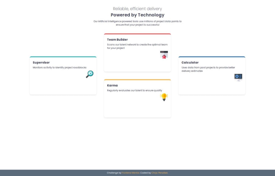
Responsive Feature Card Component Using CSS Grid & Flexbox


Design comparison

Solution retrospective
I’m most proud of how I structured the layout using CSS Grid and Flexbox to ensure responsiveness and maintain a clean, modern design. The use of CSS variables for color management also helped keep the styling consistent.
Next time, I would focus more on accessibility improvements, such as adding ARIA attributes and improving keyboard navigation. I would also consider using CSS animations to add subtle effects and make the UI more engaging.
What challenges did you encounter, and how did you overcome them?One of the biggest challenges was making sure the grid layout adapted well to different screen sizes, especially in the transition between desktop and mobile views. Initially, the layout had spacing issues on smaller screens, but I overcame this by fine-tuning media queries and using a mobile-first approach.
What specific areas of your project would you like help with?Further accessibility improvements – Are there any best practices I missed, such as ARIA roles or better text contrast? Performance optimizations – Are there any ways to improve efficiency in my CSS, particularly regarding grid and flexbox usage?
Community feedback
- P@aterviliPosted 6 days ago
It appears that the card dimensions need adjusting both height and width.
1

Please log in to post a comment
Log in with GitHub
Join our Discord community
Join thousands of Frontend Mentor community members taking the challenges, sharing resources, helping each other, and chatting about all things front-end!
Join our Discord