Design comparison
SolutionDesign
Solution retrospective
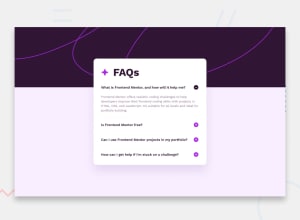
I had a lot of trouble with the line in the header. I am curious how other people solved this.
Community feedback
- @ejmabundaPosted 11 months ago
Hi @Dejorden94, regarding the lines, I just set the two background svgs provided as background image to the
<body>, then used media queries to toggle between the mobile and desktop background.I'm not sure why you decided to hard code the svg path 😬, but great job on the design. Hope this helps.
1@Dejorden94Posted 10 months ago@ejmabunda Oooooh I totally missed the background pattern file 😖
0
Please log in to post a comment
Log in with GitHubJoin our Discord community
Join thousands of Frontend Mentor community members taking the challenges, sharing resources, helping each other, and chatting about all things front-end!
Join our Discord
