
Submitted about 1 year ago
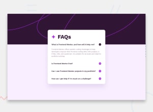
Responsive FAQs accordion with the help of display flex, position.
#accessibility

@Priyanshu-WD
Design comparison
SolutionDesign

Solution retrospective
Hi, I got to know the idea to use for Each in real projects. This project taught me a lot. The technologies I used were HTML, CSS, and JavaScript.
I gave my best to this project. Please help me to improve my code.
Thanks
Community feedback
Please log in to post a comment
Log in with GitHub
Join our Discord community
Join thousands of Frontend Mentor community members taking the challenges, sharing resources, helping each other, and chatting about all things front-end!
Join our Discord